Travel, man

I just got back from a trip to South Africa! Yeah, it was pretty great! Especially sweetened by the UK having terrible cold and snow while I was in the sun…
However, this isn’t a travelog blog, so instead of tales about safaris and speedboats, you get to read about the suitcase I took with me(!)

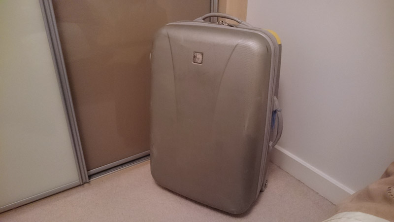
This grey fella is the Tripp suitcase that my parents take on holidays. I borrow it from them for my own hols, seeing as I go away way less than they do. It’s utterly indistinct, so to identify it as ours we apply stickers to it, tie coloured fabric around the handles, that sort of thing.

A few weeks before the big trip, Mum brought the tired-looking thing over to my place, saying that I could tart it up a bit.

I chose a Springbok for my design. It’s South Africa’s national animal, the symbol of their national Rugby Union team, and the symbol of the Friendships Association: They helped us visit my expat family over many years. I’d layer it over a green background, like below.

MAWWIAGE

The Stag Do was done and dusted. Now, with a few weeks to go until the nuptials, I could focus on building and buying various decorations and gifts for the wedding itself.

The Card


I’ve posted before about my “trilogy” of handmade greeting cards, which the couples received for their respective weddings. Above is the card I made for the newest newlyweds…
A pen drawing coloured in with watercolour paints, based on Potter Puppet Pals, writing (with a quick quotes quill) and… sysadmin stuff (a phone, displaying a monitor, displaying a skull and crossbones). Also featuring their cat in the middle.


I drew it out in pencil on A5 paper, then (to make things more complicated than necessary) scanned it in and moved elements around in Photoshop. I also roughly digitally coloured it.
Then I printed the lines out again at A6 size, with higher contrast, and traced it onto my watercolour postcards via the light box.

Sword and Shield Stags, Part 2

Part 1 was about the largest (and most fun) props from the Stag Do I hosted last month.
Now onto part 2, which focuses on the smaller props and accessories I made for the par-tay…

A golden hat


The Groom needed to stand out from the rest of us plebs. Sashes are for hens, and this was not the kind of group to all go out in full costume. I ruled out the ‘Helmet of Justice’ from Knightmare because, well, you can’t see where you’re going. That would get old fast.

Being a Discworld fan (and he’s a bit of one himself), I plummed for a Moist Von Lipwig inspired hat… with a bit of local hero Fred Dibnah mixed in.


The base hat was a flat cap from Primark. Four reasons led to this choice:

  1. You don’t want to repaint and cut holes into something pricy, or riun a costly item and need to buy another!
  2. It came in One Size (fits all), so no chance of a cap that’s too small.
  3. The groom had tried it on briefly on our suit shopping trip.
  4. The hats in the costume shop were made of an uncomfortable, hard plastic.

Sword and Shield Stags, Part 1

Did I mention I was picked to be a Best Man this summer? Well, that happened. Which means that one of my duties was to organize the Stag Do.

Here’s post 1 of 2 about the props I made for my friend’s Stag Do, and a few things I learned along the way.

Picked because:

  • the historical role of the Best Man was to stand guard, in case the adbucted bride’s family came a’knocking,
  • because we’re all nerds,
  • I thought that gently beating the Groom would be funny,

Ladies and Gentlemen… a sword and shield on a budget.

And the nerds rejoiced.

Take Any Heart

This year’s Valentine’s Day celebration / penance wasn’t cards for selected individuals: It was a benevolent lucky dip for everyone at work. Here’s how it came together…

The first task was learning to make an origami heart – these are the instructions I followed.
I bought a roll of red paper, cutting it into 7cm squares.
Why a roll of paper? There needed to be one heart for every member of staff present that day, plus a few spares.
I assembled 121 of the things.

Oh Boy!

A couple of friends had their first child this week – a baby boy – and there was much rejoicing.

This card came together around Easter-time, hence the theme. The main decoration is felt, with pen for the eyes and mouths. Kids love felt. Lightly concerned that kids love to eat everything too, considering UHU binds it together. I rounded the corners at least.

The process of construction was roundabout…

Christmas Colours

Last year my Christmas cards were store-bought with a doodle drawn inside. This year my own watercolours are on the front!

prev3-500

Each card has a different picture; I’m particularly pleased with how the animals (drawn from reference) came out. The pics are applied to the front of each card with a gold backing, and a bit of gold ribbon in a tiny classic knot.

Thread Count

Update: Off The Market was been accepted, and voting is now closed.

Threadless is arguably the most famous t-shirt site. Artists submit designs, either in general or as part of themed contests, which are then voted upon for a chance to join their product line. They’ve expanded into further clothing, wall art, cards, phone cases… good fit, good quality and good designs.

After posting earlier this month about all those cards I made, a Threadless newsletter had a word in my ear, introducing the contest Greeting cards II. T’was a sign!

I’ve tidied up two cards which are featured on my portfolio pages, but have only been mentioned in passing. Get Better Than The Weather was a Get Well Soon card for a work friend, while Off The Market was a Valentine’s Day card for a newlywed, but for the purpose of the voting is a Wedding congratulatory card.

Both are now up for scoring on Threadless for the next 9 days (until about the 6th of June). Click a link or picture below to hit ’em up high, why don’t you?

Get Better Than The Weather - click here to go vote

Off The Market

Matrimony Triptych

May 4th 2013 starred the third wedding i’ve attended in six months. I mentioned these upcoming nuptials when showing off the last wedding card i’d crafted… you can see where this is going.

Turner's Card
Being Doctor Who fans, Mr Turner’s holding a Sonic Screwdriver.

As the Turners had been raving about Matilda the Musical, their card is in the style of Quentin Blake, famous for illustrating Roald Dahl’s children’s books. Like the time I made that Master System cover, it was interesting to actually try and reduce proficiency, making lines sloppier and slipping some colour outside them.

Commitment, Salvation and Diction

I’ve reached that age bracket where a lot of my friends are getting married. I made a card last winter for one couple who got hitched, and yesterday another pair tied the knot!

I’ve known Mr West for almost a decade, and the now Mrs West for nearly as long, so they most certainly had to have a homemade card too. This one is also a pen and watercolour work, yet there’s no imitation of famous artists this time around.

Wedding Card for Mr & Mrs West
Deciding the inscription took some time.

This duo of feelies will likely become a trilogy, as there is one more wedding next month. The occasion is on May the Fourth, so stay tuned to see if I infringe on any Star Wars copyrights.

An acquaintance (who is already wed, for those keeping score) is branching out into his own first aid / CPR training business, and he knew I was the guy to hit up for a logo. Research showed that this kind of company always seems to use a combination of lovehearts, heart monitor lines and first aid crosses for it’s identity, so this one took a bit of a think to make more distinct. There was a heap of back-and-forth communication involved: Getting it down to case designs, then the decals, the colouring, selecting the font and word arrangment…

Save Someone logo - highlights of progress
Just some of the options exchanged by email.