I told you last time that I had to prepare for Valentine’s Day… my friend’s birthday. As it was her 30th, there was actually a really good surprise party that weekend, but that’s beside the point.
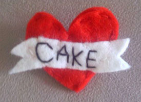
I genuinely didn’t have anything planned for this year. About a week before the 14th, I decided to wear this felt badge/brooch from Made By Millie on the day itself (which was spent at work) – It’s like those stereotypical sailor tattoos, a heart with a banner across, only it says CAKE instead of MUM.
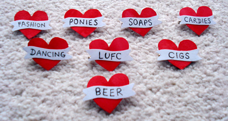
That’s where the idea came from: Rather than another round of cards like people got last year, this year the gifts would be a variant of that heart. So:
There was also DANGER, which didn’t make the photoshoot.
Also, a friend got married last weekend – the same one that received the social butterfly, if you’re keeping track of such things.
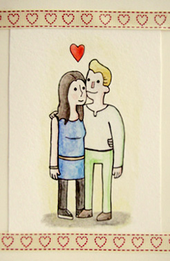
The card I handed to the groom at their reception sports a cheery watercolour of the newlyweds in Scott’s style. I haven’t used watercolours in a long time, so it worked out nicely for a “first go”!
Groom, if you have lost the card, I will tell Liam Neeson that you took his daughter.
Scott’s gonna have a table at the Thought Bubble comics convention next week: I’ll get him to sign my copy of his new Great Showdowns book, and maybe get to show him the above!
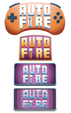
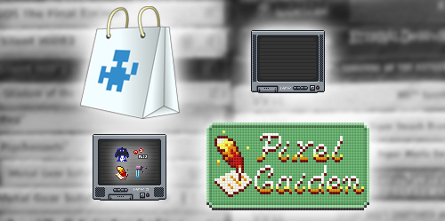
So, “expansion”? Regular client and friend Final Boss Fight – The video game news site has grown into a whole network! I didn’t brand A to Play (playthrough videos), and Pixel Gaiden (editorials) was straight-foward, but AutoFire (news feed) had a little journey. Observe:
The joypad buttons say “FBFN”, as in “Final Boss Fight Network”.
The top one was pretty unintelligible at small sizes, while the second one (originally with a red backing) looked like it should be hung outside a fire station. To give each site different colours, blue and purple came into play. Then it moved into the same frame-size as the main site and editorial logos, and finally, by request, pixelated to match the existing hub logo.
A bunch of other assets were cooked up too – a couple of CRT TVs, favicons, and a few pics to replace the stock ones on the network hub, including a quick shot of my games shelf and a Store image.
Pixel Gaiden is a Phoenix Down quill and Minecraft paper, by the way.
There’s one more logo, but the site’s not live yet so it’s still under wraps. It’s not pixular, I promise.
Random ending: I updated the mobile phone icon on my Contact page, because I haven’t used a phone with those things called “buttons” since 2010. The old one was a Nokia 3110c – It’s now an Orange San Francisco II.
A recent discovery: Since moving house, I now live near several print shops.
Hee.
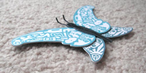
My first print-off was to make a present for a best bud leaving work… for a mid-term secondment, not too far away. And still around most weekends. Still, reasonably out of sight for long enough to gift a Social Butterfly. It was drawn in Illustrator, then made into a delicious double-sided paper-cardboard-paper sandwich. Most of the shapes on it are based around things that she’s done or known for. It was welcomed.
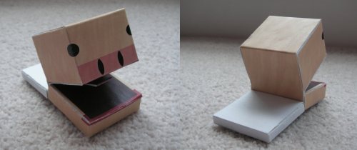
I got a few items from the printers, not just the butterfly. The next build? My Cubivore papercraft, having lain dormant for a year or two, has been adjusted and released. Niche to say the least, Cubivore is a strange GameCube game from 2002, and (whisper it) dated with bad controls, but it is unique, charming, and quite rare.
1-limb variety, either a PaleDark Purpial or Dark Greyodon. Thankfully, I had to look that up.
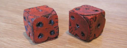
Things generally come in threes, so here’s your third. Delving further back into time, I made a die based on the ones in The Nightmare Before Christmas. Various things happened, and I never made the second die… Until now!
The left one is the new one. Both dice 1.5cm.
This didn’t require a walk to the print shop. A chunk of the weekend was spent cutting out cardboard shapes, boring holes in them, attaching them to the second die and painting them with acrylics. Allons-y!
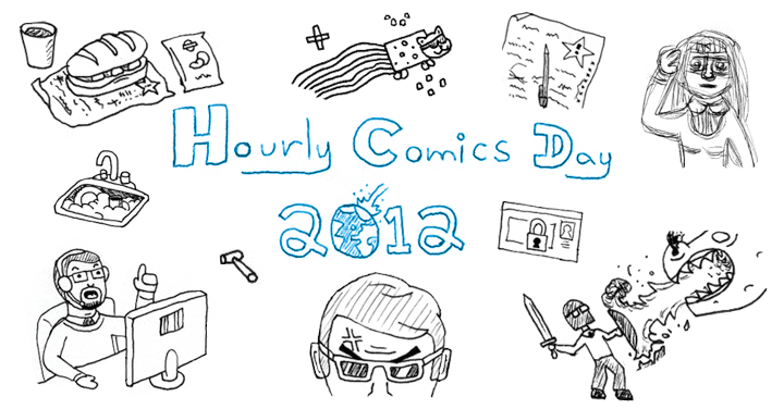
As evidenced by the above, the time came for my second entry to Hourly Comic Day! Since last year’s edition I’ve gained employment and moved house, so it took a few days to finish the sketches. More time passed before a scanner was obtained, but I uploaded rough camera pics for the interim. This link or the above image lead to this year’s submission.
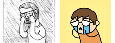
Insider bonus: Panel 2 is basically People I Know fan art.
Boohoo. Left is mine, Right is Timothy Winchesters.