My Red Mill Collection

By Red Mill, I mean Moulin Rouge, that infamous cabaret that ended up romanticized in Baz Luhrmann’s musical of the same name.

4 or 5 years ago, during uni lectures, I did a doodle in a sketchbook – Harold Zidler from the film, spouting a catchphrase. This turned into a t-shirt printed for a friend, the image created in Macromedia Flash, JASC Paint Shop Pro and Microsoft Publisher (of all things). Later on, while teaching myself Illustrator, I did a few more characters. Skip forward to today, down that slippery slope; now there are eighteen of them.

Carl Mitchell's Moulin Rouge Rosettes - Click to visit collection

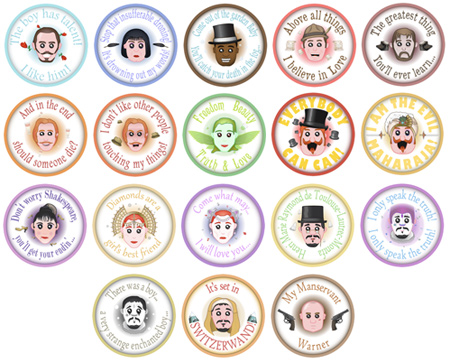
I finished a couple of stragglers off this weekend. This is almost certainly the final update: I do have a vague plan for two more in the future, but they’re not getting brought out right now.

The DeviantArt collection has been brought fully up to date – the Flickr set and example on my portfolio will follow at a later date. I’m going back to learning catalogue layouts now…

p.s. Did you notice that this site’s header and footer have been changed? Yep, that was snuck in last week.

Jailbreak

A Wednesday update – weren’t expecting that, were you?

It’s back to designing this week; Illustrations have had a good run for a bit.

Bradford University has a Student Union that puts on plenty of events. While their website and posters are vibrant and full of colour, they make me feel a bit ill with their colour choices and production values.

So, my latest target: The 2010 “Jailbreak” logo and poster. This is what was plastered up all over campus:

UBUonline's Jailbreak 2010 poster

And, well, this was my reaction:

Phoenix Wright Shocked - Animated GIF

My revamped (and unofficial) result is below…

Jailbreak 2011 - thumb

…perhaps I went a little overboard with the brown, which could detract from the poster’s attention-grabbing power from a distance. It does have meaning though – It’s a deliberate callback to the look of those old sailor’s maps (like the ones pirates used) and the old wanted posters (think Westerns and Oh Brother, Where Art Thou?). It also allows people to focus on the information over it, nicely prison themed.

Considerations of the Alphabet

There was a picture my brother used to have. It was his name, with the letters surrounded by Gnomes, or Gnomes hanging off them. A personalised image. You see mugs and keyrings all the time, all the same pattern, just with different children’s names on them.

Consider the following image, which I have made, and which has taught me several things in its creation.

Chloe Safari - Click for larger image

Chloe is my second cousin. Her father is from England, but she lives in South Africa, so the above image features animals from the region. Research: Obviously you won’t get a Koala in S.A., but you do get Penguins.

The image above has the animals at random. As H is not for Giraffe (shame, it fits the shape nicely), some educational folks might want the animal lined up with it’s corresponding letter. Restricting the region is just asking for trouble – there’s a lack of African animals beginning with X – but when considering the audience of this piece, do you line the animals up with their English initial, or their African name? In England it may be M for Monkey, but down there it’s A for Aap (pronounced ‘arpy). As a side note, this is also why most animals in pictures such as these aren’t fully entwined with their letter – you can’t fit a Wildebeest into a W without ruining it’s skeleton.

There is also efficiency. If you want a mix-and-match theme, so any name can be put together, you have to create images for all 26 letters. If you want lowercase letters (as above), you have to double that. Going worldwide could easily drive a man to madness, with accented letters, minor punctuation, cyrillic lettering, even hebrew or kanji to cater for, before you dared to assign the correct letter to an animal for it’s language.
No wonder all the ones i’ve seen are English and all in capitals.

I have the urge to try again, but with an overall less demanding theme… and not matching the initial.