Who’s Got the Time: The Poster

This time next week, the 24 Hour Show will kick off.

At the Bradford Playhouse on Friday night, Bradford Uni’s musicals society (BUSOM) will learn what show they’re performing for the paying public exactly 24 hours later. Everyone stays up all night, learning songs and lines, building set (safely!), painting, rigging, sewing… and eagerly anticipating the breakfast butty run.

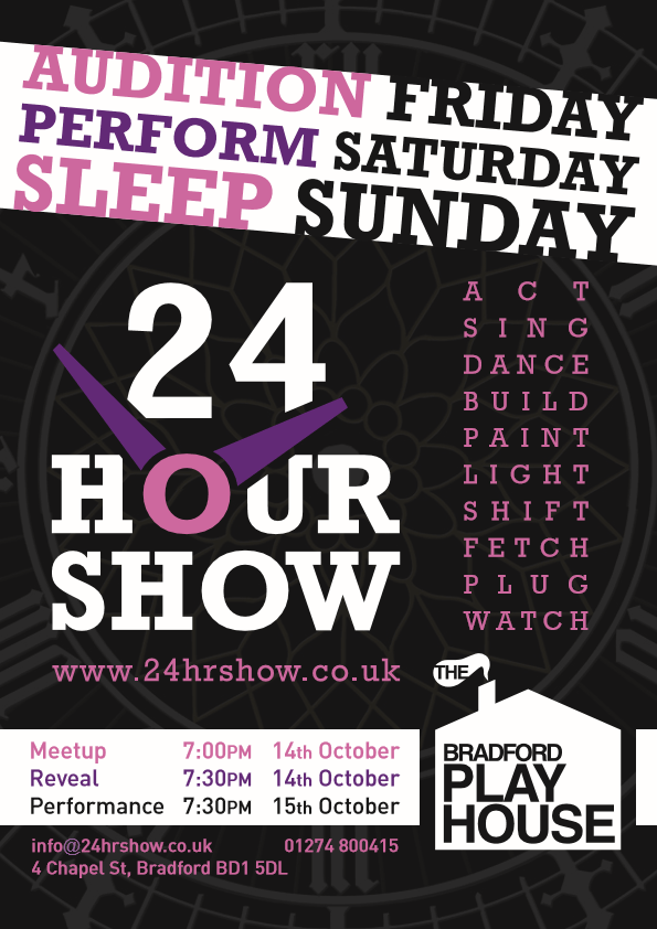
I thought the show poster had featured on this blog already, but my post about the 2014 event pre-dates it. Let’s rectify that right now. Behold, the 24 Hour Show 2016 poster:

24 Hour Show 2016 Poster
Audition Friday – Perform Saturday – Sleep Sunday.

A Whale of a Tale, Act 1

The Bradford University Society of Operettas and Musicals – BUSOM for short – performed their 2015 main show last week. Moby Dick! The Musical sees a St. Trinian’s-like girls school (complete with headmistress played by a man in drag) putting on a musical version of Herman Melville’s novel to save their bankrupt institution; hockey sticks for harpoons and all.

BUSOM’s staple poster creator has graduated, moved away, and become very busy. I was picked to work on the main show this year. That meant it was up to me to get that ‘play within a play’ message across.

First up, posters for the cast auditions. Over the post-Xmas holidays I came up with the below pic, for the production team to surround with the relevant text. This was the birth of Audition Whale, drawn with Illustrator’s standard but useful Charcoal brush.

Audition Whale quickly gained fans.

Chalk drawing of cartoon whale on blackboard
Look at its stripy school tie!

The Opera Post, Act 1

This month The New Bradford Playhouse put on an in-house production of Maskerade, adapted from the Terry Pratchett book of the same name (think Phantom Of The Opera with humour and witches). I haven’t been on that stage in a long time, and love the works of Pratchett, so I signed up.

My main role was one of the stagehands who are actually part of the play, so as well as spouting lines i’d shift furniture, in sight and out of sight of the audience. I had two other bit-parts in one scene each, with quick costume changes. Along with learning script, stage directions and set mechanics, I also made the show’s programme, some posters, two Papier-mâché masks for the cast, and one mask for myself. In 4 weeks. Oh, and I started a new full-time job at the same time.

Cooking up layouts

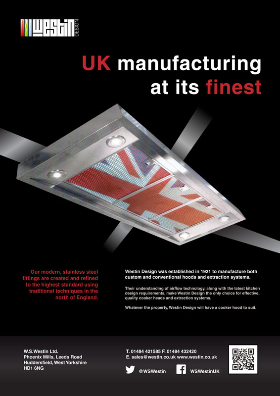
As per usual in a design company trial, a bit ago I had to make a layout out of supplied assets. I got to keep an A3 printout as a souvenir; as that memento is a bit crinkled, attracts dust, and doesn’t fit in my scanner, I quickly recreated a neater pic for you:

primetrialad-rebuilt

Lay Layout Lay

…Lay across my InDesign spread.

Yes, today’s theme is layouts: Recently I put together a few new compositions, and polished up a couple of older ones.

When it comes to publishing software, there’s essentially two rival firms: Adobe (them of Photoshop) make InDesign, while Quark produce QuarkXPress. I haven’t used the latter for a long time, so I was sure to roughly re-create at least one of these ID works in QXP, looking up how to do particular actions when required. While features like arranging items forward/backward have yet to be discovered, it served as a good refresher task.

So, play the gallery theme in another tab and scroll down: You can click on any of the images for a larger view.

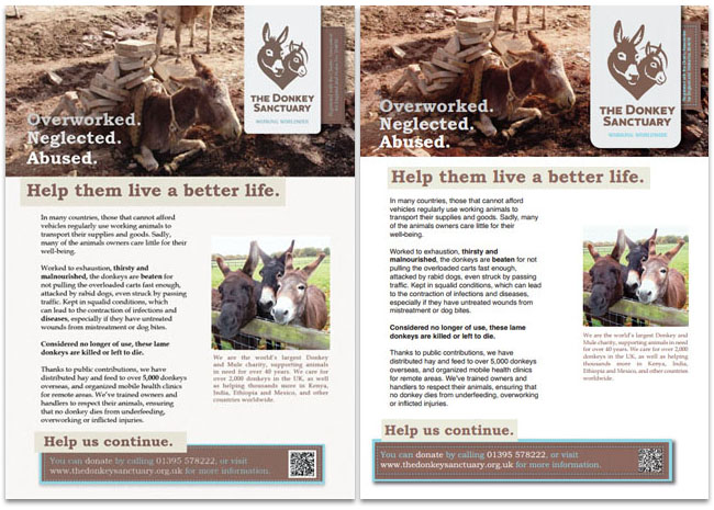
Donkey Sanctuary posters

InDesign version on the left, Quark practice on the right. The Donkey Sanctuary’s website has a pleasing colour scheme, which has been carried over to this. I also used a method from The Sun newspaper, in that specific words are made bold for emphasis.

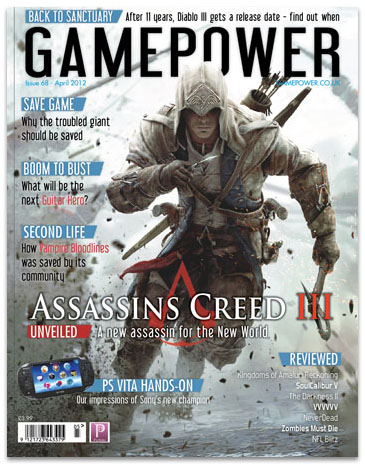
d-t-gamemag

Moving on to this magazine cover, there’s a lovely triple meaning in the cover line “Second Life”: First off, it’s the name of an unrelated but well-known video game. Secondly, Vampire: Bloodlines is based around Vampires – creatures in their ‘second life’. Finally, Bloodlines has been given a new lease on life since the development studio closed, as fans fixed bugs and restored incomplete content!

Jailbreak

A Wednesday update – weren’t expecting that, were you?

It’s back to designing this week; Illustrations have had a good run for a bit.

Bradford University has a Student Union that puts on plenty of events. While their website and posters are vibrant and full of colour, they make me feel a bit ill with their colour choices and production values.

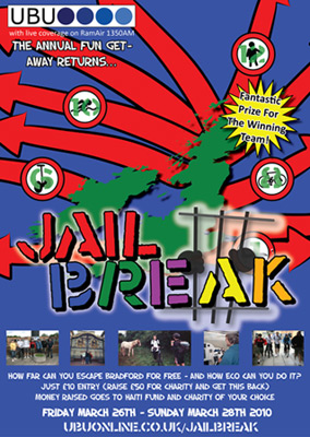
So, my latest target: The 2010 “Jailbreak” logo and poster. This is what was plastered up all over campus:

UBUonline's Jailbreak 2010 poster

And, well, this was my reaction:

Phoenix Wright Shocked - Animated GIF

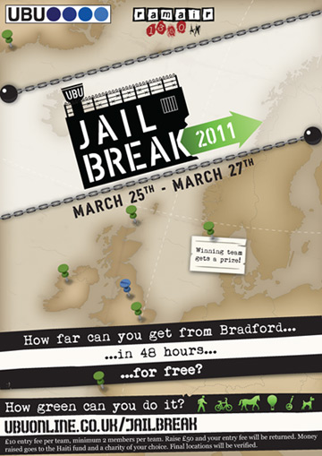
My revamped (and unofficial) result is below…

Jailbreak 2011 - thumb

…perhaps I went a little overboard with the brown, which could detract from the poster’s attention-grabbing power from a distance. It does have meaning though – It’s a deliberate callback to the look of those old sailor’s maps (like the ones pirates used) and the old wanted posters (think Westerns and Oh Brother, Where Art Thou?). It also allows people to focus on the information over it, nicely prison themed.