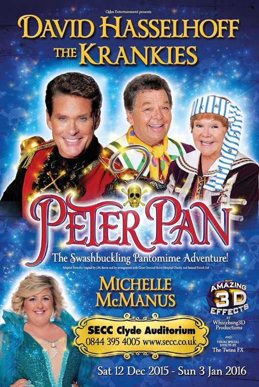
You live in the UK, you know what a pantomime is! A family comedy theatre performance, with audience participation, usually based on folk tales, with local / lower level celebrities in some parts. “Panto” for short. They show up during the Christmas season; Aladdin is currently running in Halifax, while Bradford’s Alhambra is going with Peter Pan.
Now that I’ve opened with ‘Panto season coincides with the Christmas season’, I’ll start the double bill with Pantoland’s Got Talent… which was performed in Spring.
Act One: Pantoland’s Got Talent

Pantoland’s Got Talent was a completely original play, the writing debut for a member of Shipley Little Theatre. It featured all the denizens of Pantoland putting on a talent show.
For an Illustrator / vector advocate, quite a lot of this was made in Photoshop for the effects… then layered back in to Illustrator.
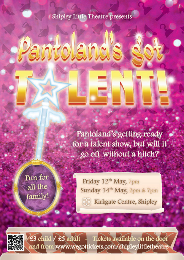
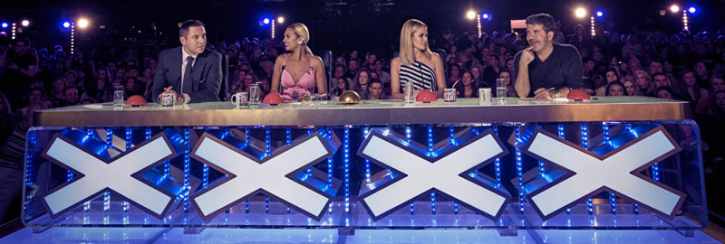
The UK’s biggest talent show is The X Factor, which took over from Pop Idol in looking for singers, and went on to become a worldwide, annoying sensation. The UK’s other biggest talent show, the one that this pantomime takes it’s title from, is Britain’s Got Talent. Produced by the same company as X Factor, incidentally. It has singers, comedians, dancing dogs, sword swallowers… anyway, here’s the ofiicial logo. Note the star instead of an ‘A’.
![]()
Now see that my the ‘A’ in my poster is a star wand. Like the kind Fairy Godmothers tote around.
While we’re looking at the lettering, let me mention that this ‘arabian’ looking lettering is quite common on pantomime posters.
The font I used is called Kingthings Petrock. For the ‘quick’ 3D effect, I duplicated the yellow text, put it behind, moved it down a bit, and turned it red.
The yellow and red letters got gradient overlays, innder glows and outer glows (with noise applied!). They were then warped (Photoshop skew / perspective transform) to add a look of perspective.
I wish my lettering looked more golden, maybe more ornate, but time was short!
The next ‘pantomime poster trope’ would be headshots of the stars. Sadly, there was no time or budget for this, so that trope went amiss.
Contemporary pantomime posters often have this this ‘sparkles’ or ‘sunbeams’ effect in the background. My ‘god rays’ took some effort to make – following this tutorial here – yet ended up toned down for the final poster.
As much as I am an advocate for vectors, there are a couple of images in there. One is the smoke effect in the Magic Mirror. The other is the background image, a glitter wallpaper that was colour adjusted. The background is overlayed with a tiled pattern made up of five fairytale items: Slipper (Cinderella), lamp (Aladdin), bell (Dick Whittington (and his Cat)), pirate hook (Peter Pan), and an axe (Red Riding Hood).
One more thing… the contact information at the bottom is over four red Xs in a plinth. Looks familiar?
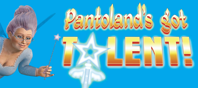
Now all that’s said and done, on to the second panto poster…
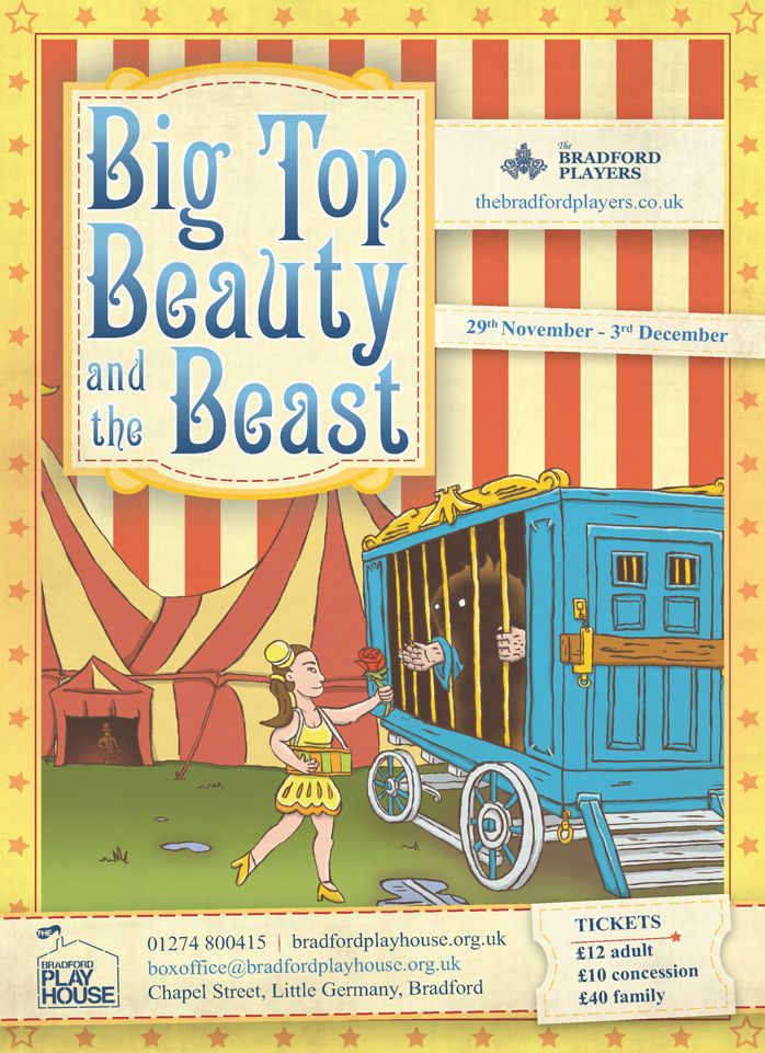
Act Two: Big Top Beauty and the Beast
More original writing, only this pantomime is an adaptation. It’s a circus version of Beauty and the Beast, with beast boy and snacks girl coming together despite the Ringmaster’s interference! It’s on at the end of this month.
Whereas the Pantoland poster was quite traditional in it’s appearance, the BTBATB (what an acronym!) is more standard. Apart from a few pointers on the parts and overall style (and of course, jamming all the relevant details on), I was given free reign.
Here’s the finished article…
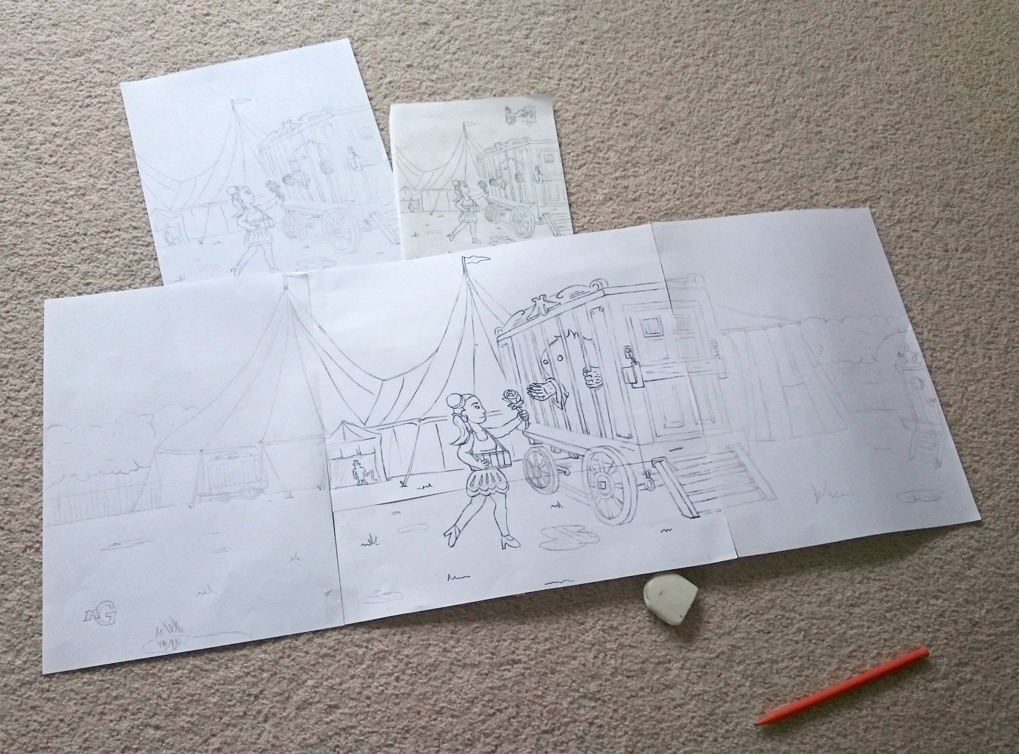
…and here’s the first sketches, the tiny acorns from which this grew!
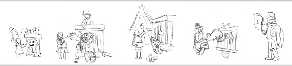
I picked the centre sketch, got out an A4 sheet of paper… tore it in half, then drew out the first version of the image. It didn’t look so bad!
I gave it a few tweaks, scanned it in, and coloured digitally in Photoshop. While it doesn’t mention what to do with the outlines, here’s a good digital colouring tutorial from the great Nedroid.
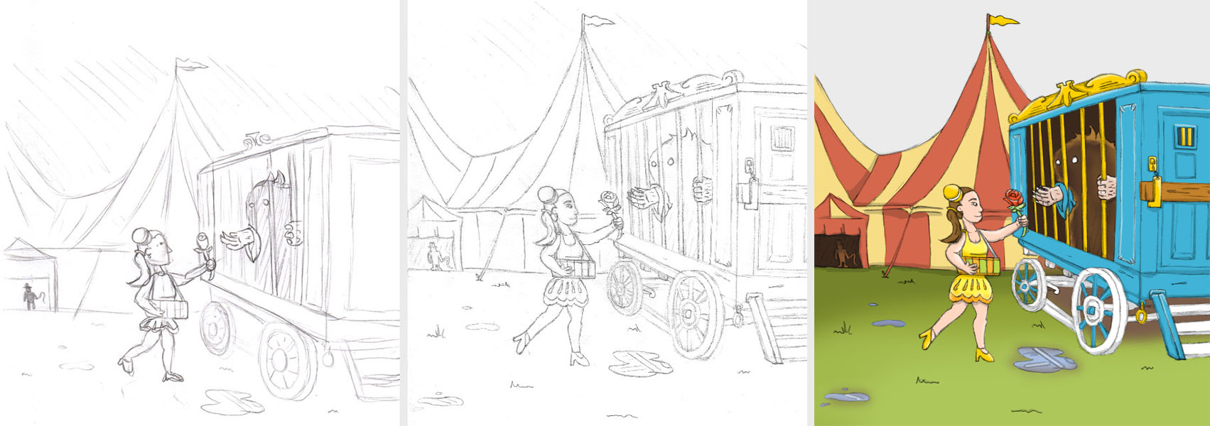
This worked fine for the A5 flyers, and the A4 posters. It didn’t even need to be inked!
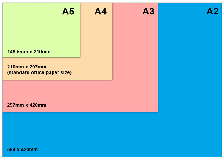
It could have worked for the A3 posters (for the auditorium), but making the image larger was making it a little blurry by this point.
Then the A2 size posters were requested.
Blowing up the sketch to 283% of its original size? Not a chance.
Now I had to go redraw everything. In pen. At a reasonable size this time.
For this task, I bought a new toy.
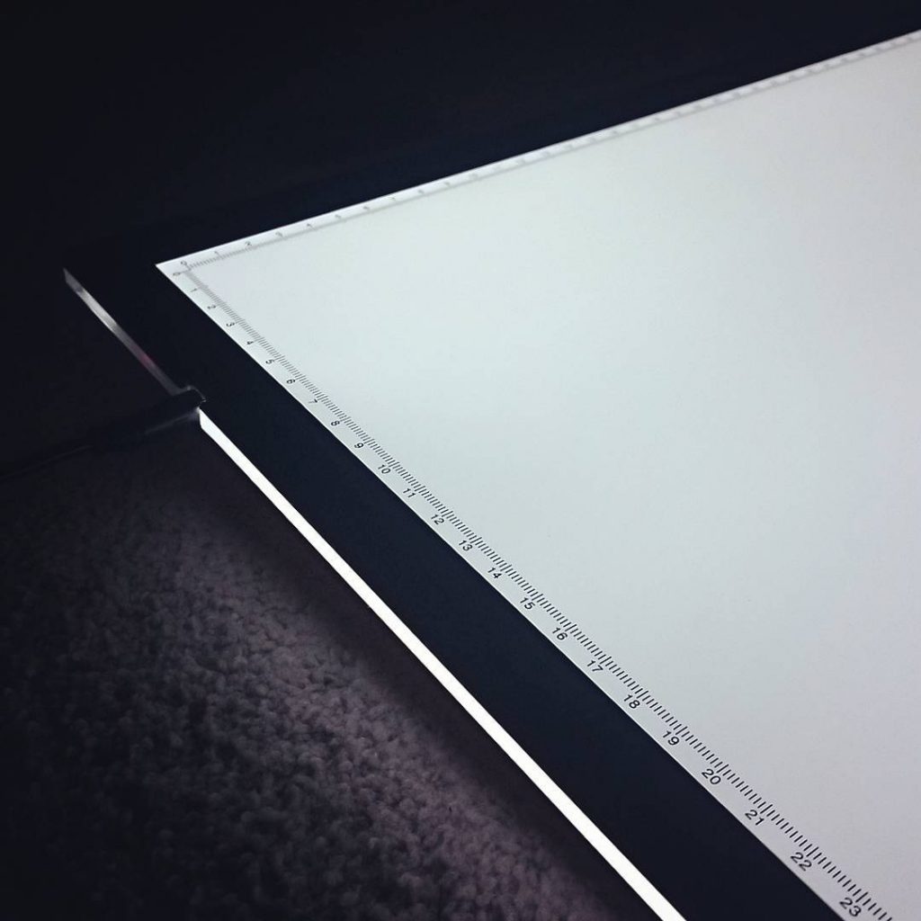
A Huion A3 LED lightbox. Bigger and better than my old lightbox in almost every way. A larger surface area, thinner, more even and white lighting (rather than the warm yellow bulb). The light’s adjustable too: Hold the button to brighten or dim the pad.
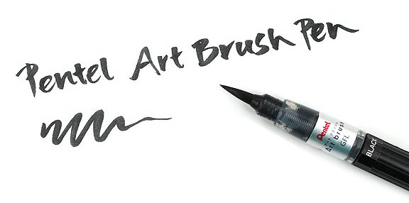
I magnified and printed the original, and got tracing. This also let me break out my second “new” toy: A Pentel brush pen. I actually bought it over a year ago, but only opened the packet when this project came around! Reason being, they take some getting used to, so my lines are a little sloppy. Good enough for this though, and certainly an interesting tool to use.
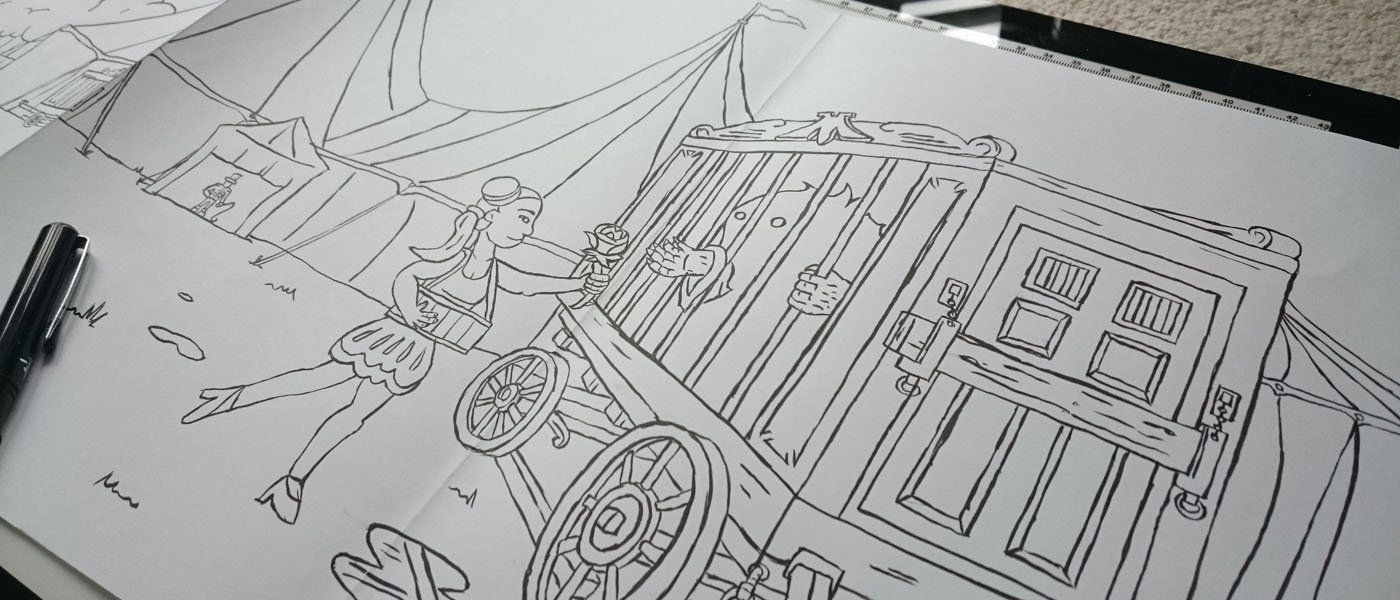
The original sketch had been hard to scale, as I hadn’t drawn anything off the edges. If I wanted things slightly smaller, or wider… oops, run out of artwork. Ugly gap. This time I sellotaped together sheets of paper and drew way more than needed.
Behold, the full spread, coloured!
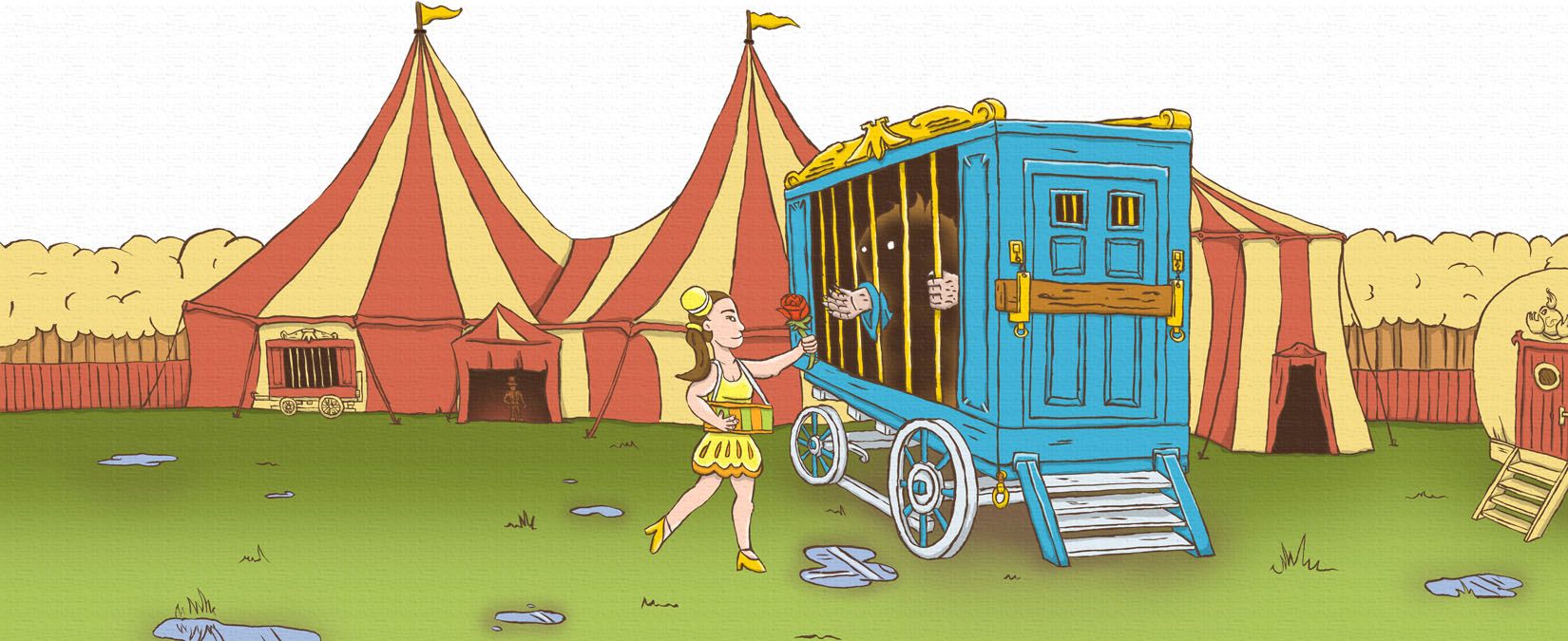
I plonked it all into the layout I’d come up with, replacing the pencil version. Not as much to say about this one – it’s all based on circus posters, with stripes from circus tents and popcorn boxes. The title font is Campanile, and it has that ‘Absinthe’ feel to it. Some boxes have stitching (dashed stroke borders) and look like ticket stubs, and everything has an image overlay to add texture.
A little extra

A few weeks before Big Top Beauty and the Beast‘s due date, I got a message from the Bradford Players… their original designer’s hard drive had gone poof. Their logo disappeared into the ether, with no backup copies, paper or digital.
I had a crack at recreating it.
 The above was the best surviving copy. Just good enough to work with. Most of the details were still visible: Those that weren’t were in the shield, which is the coat of arms of Bradford City Council. Good news, then; I could simply find another photo of the crest and work from that.
And so I did. I merged an enlarged copy of the surviving logo with a nice coat of arms from Google. Set it in the backmost layer of an Illustrator file as a template. Draw lots of shapes over it (slightly transparent, so I could see the photo) to try and match what went before, making small tweaks where it felt necessary. One that was settled, I merged the shapes so it became a single silouette.
One concession was made: The word ‘The’ is in a scripture I couldn’t identify. Rather than tracing it exactly, I actually close to replace it with a more common font: Bickham Script Pro.
The ‘Bradford Players’ lettering remains the terribly common Cambria Bold.
From what I remember, Pantomime’s will usually end with a singalong. As it’s now Christmastime, here’s ‘Let It Snow’ – from that classic Christmas movie, Die Hard.
Merry Christmas Panto Season!