Pixel week

Last weekend I was contacted by a guy who had seen some of my old work – a sprite sheet for a pixel art city. He’s wondering if I can help his team out on a project. Having not done pixel art in 5 years, I wondered that myself.

So, I took the sample image he’d sent me and went isometric on it: It reminds me of Pokémon.

Carl Mitchell's pixelart brown house

That went rather well rather quickly, so I stepped up the ambition for the second image:
Carl Mitchell's pixelart White House

Yep, that’s the White House. No surrounding buildings or vegetation on 1600 Pennsylvania Avenue, but bear in mind it started out as a test (even if it did take a few days). I think I succeeded.

Catalogues, not Catalogs

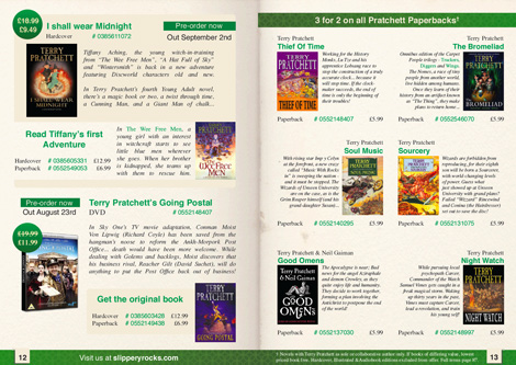
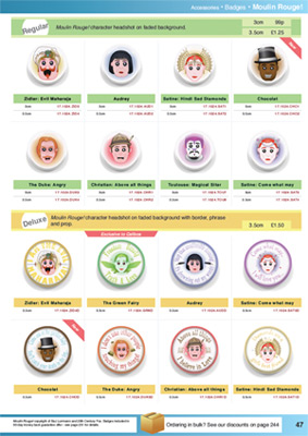
This week, I present two catalogue layouts, made while practicing. The first one (Moulin Rouge badges) is a single right-hand A4 page, while the second (Terry Pratchett books) is an A5 2-page spread.

A few things I have learned while working on these:

  • It’s amazing how much more artboard you have working in print.
  • I now completely understand Bleed and Slug.
  • Products in the outer corners of a spread get the most attention.
  • InDesign’s colour managed system is a bit tricky.
    • Although LAB is not a bad alternative to HSB.
  • Adobe Acrobat can’t export anti-aliased images.
  • My printer is still terrible and a liar.

Alright, have a looksie. Click to visit the larger versions, of course.
The badges one:

Badge Catalogue page - Click to enlarge

…and the books one:

Book Catalogue pages

p.s. It’s “Catalogues” because that’s the British spelling.