A Whale Of A Tale, Act 2

Part 1, talking about making the posters for this show, can be read here.

A couple of months after the posters were completed, I sat down with the show’s producer to work on the programme. Having made the programme for Maskerade last year, and doing a bunch of layout work at my job, I had more experience at it this time around.

For a start, I asked the producer how many pages it was going to be, and what the basic layout was. This is the very very first draft:

Folded paper with "Director", "Plot" and "Song List" written on it

Don’t laugh, it’s useful!

The Opera Post, Act 2

In my last post I mentioned that I had many tasks for the New Bradford Playhouse’s in-house production of Maskerade. Last time we talked posters. Today, we focus on the programme.

A 12-page booklet, the whole thing was designed to be printed in black and white on ordinary office paper. The audience got such a version, while I gifted some cast and crew members this borderless, colour cover variant. It contains the usual suspects: a synopsis, cast list, crew list, rights, a word from the director, a bit about the theatre and what’s being performed there next. A nicety is that being an internal production on a shoestring budget, there’s no advertisements. The cast pages ended up being the centre spread, which was ideal.

mask-prog-cast1

Cooking up layouts

As per usual in a design company trial, a bit ago I had to make a layout out of supplied assets. I got to keep an A3 printout as a souvenir; as that memento is a bit crinkled, attracts dust, and doesn’t fit in my scanner, I quickly recreated a neater pic for you:

primetrialad-rebuilt

Fresh Face

Behold, the site is refreshed! The visual shift came about as this blog is now powered by WordPress. There’s a reason it’s one of the top names in Content Management Systems: It sees a heck of a lot more updates, support and plugins than my previous CMS, Habari. Everything has been ported over except the comments, and there may yet be an injector for those. All in all, I like it.

If you want an update with a picture in it… my deviantArt account passed 7,000 pageviews a few days ago. I did a comic for 2, 3 and 5 thousand views – The 7,000 views comic, featuring old character Super Turnip, is now up.

"Did someone say my name?"
“Did someone say my name?”

Lay Layout Lay

…Lay across my InDesign spread.

Yes, today’s theme is layouts: Recently I put together a few new compositions, and polished up a couple of older ones.

When it comes to publishing software, there’s essentially two rival firms: Adobe (them of Photoshop) make InDesign, while Quark produce QuarkXPress. I haven’t used the latter for a long time, so I was sure to roughly re-create at least one of these ID works in QXP, looking up how to do particular actions when required. While features like arranging items forward/backward have yet to be discovered, it served as a good refresher task.

So, play the gallery theme in another tab and scroll down: You can click on any of the images for a larger view.

Donkey Sanctuary posters

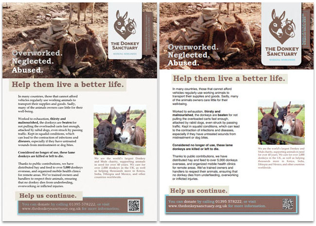
InDesign version on the left, Quark practice on the right. The Donkey Sanctuary’s website has a pleasing colour scheme, which has been carried over to this. I also used a method from The Sun newspaper, in that specific words are made bold for emphasis.

d-t-gamemag

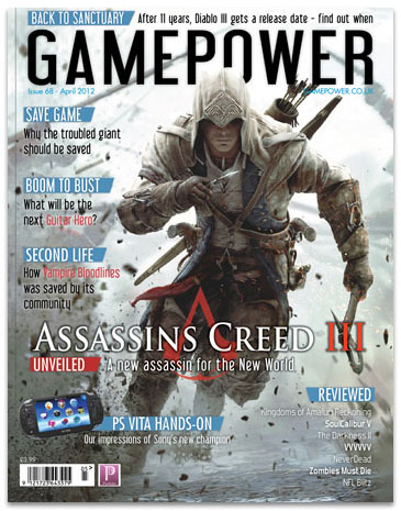
Moving on to this magazine cover, there’s a lovely triple meaning in the cover line “Second Life”: First off, it’s the name of an unrelated but well-known video game. Secondly, Vampire: Bloodlines is based around Vampires – creatures in their ‘second life’. Finally, Bloodlines has been given a new lease on life since the development studio closed, as fans fixed bugs and restored incomplete content!

Catalogues, not Catalogs

This week, I present two catalogue layouts, made while practicing. The first one (Moulin Rouge badges) is a single right-hand A4 page, while the second (Terry Pratchett books) is an A5 2-page spread.

A few things I have learned while working on these:

  • It’s amazing how much more artboard you have working in print.
  • I now completely understand Bleed and Slug.
  • Products in the outer corners of a spread get the most attention.
  • InDesign’s colour managed system is a bit tricky.
    • Although LAB is not a bad alternative to HSB.
  • Adobe Acrobat can’t export anti-aliased images.
  • My printer is still terrible and a liar.

Alright, have a looksie. Click to visit the larger versions, of course.
The badges one:

Badge Catalogue page - Click to enlarge

…and the books one:

Book Catalogue pages

p.s. It’s “Catalogues” because that’s the British spelling.

Jailbreak

A Wednesday update – weren’t expecting that, were you?

It’s back to designing this week; Illustrations have had a good run for a bit.

Bradford University has a Student Union that puts on plenty of events. While their website and posters are vibrant and full of colour, they make me feel a bit ill with their colour choices and production values.

So, my latest target: The 2010 “Jailbreak” logo and poster. This is what was plastered up all over campus:

UBUonline's Jailbreak 2010 poster

And, well, this was my reaction:

Phoenix Wright Shocked - Animated GIF

My revamped (and unofficial) result is below…

Jailbreak 2011 - thumb

…perhaps I went a little overboard with the brown, which could detract from the poster’s attention-grabbing power from a distance. It does have meaning though – It’s a deliberate callback to the look of those old sailor’s maps (like the ones pirates used) and the old wanted posters (think Westerns and Oh Brother, Where Art Thou?). It also allows people to focus on the information over it, nicely prison themed.