
Part 1, talking about making the posters for this show, can be read here.
A couple of months after the posters were completed, I sat down with the show’s producer to work on the programme. Having made the programme for Maskerade last year, and doing a bunch of layout work at my job, I had more experience at it this time around.
For a start, I asked the producer how many pages it was going to be, and what the basic layout was. This is the very very first draft:
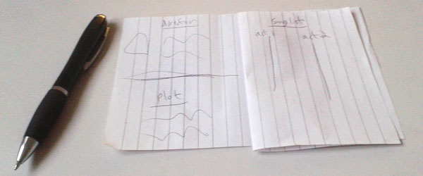
Don’t laugh, it’s useful!
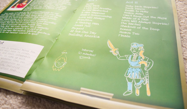
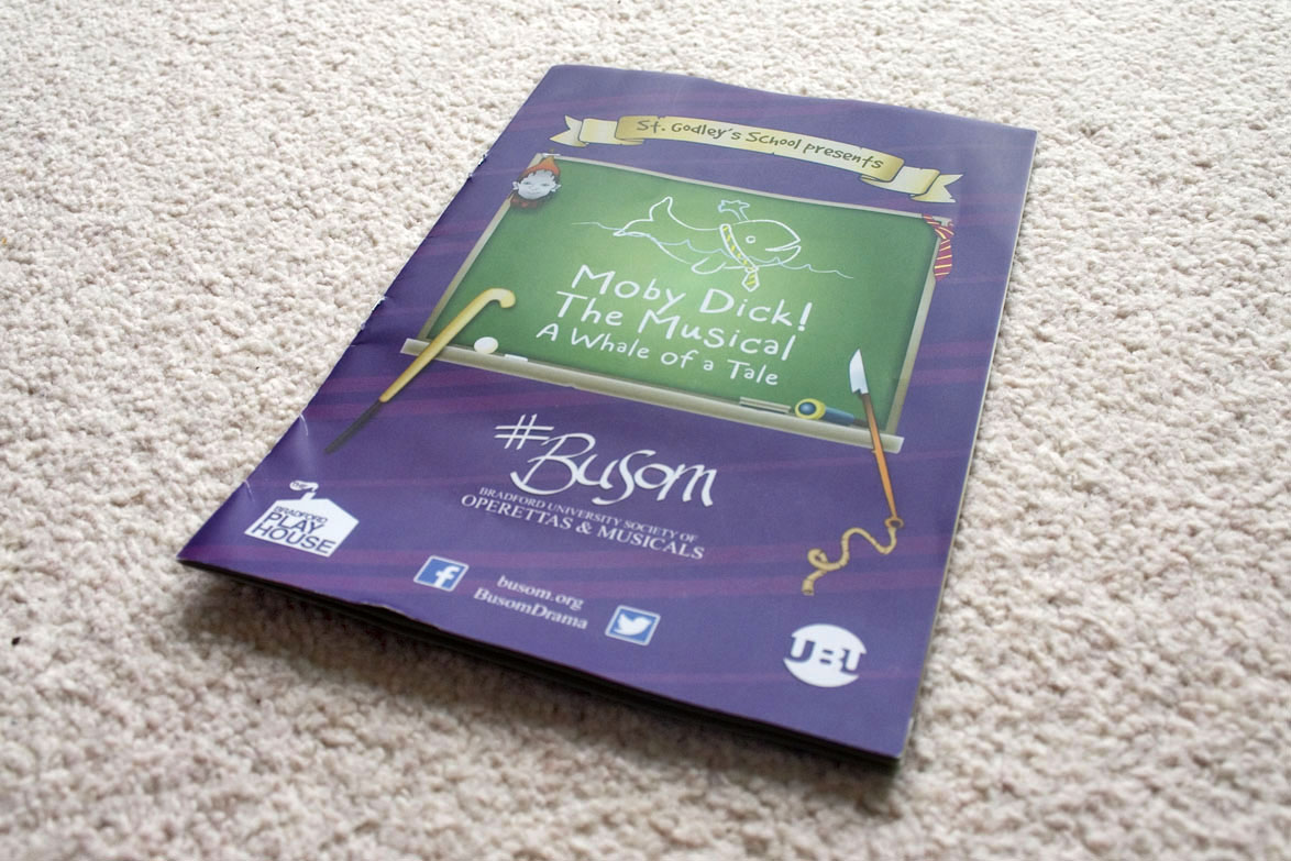
Passing on the ideas of ‘plain background’ and ‘corkboard messageboard’, we expanded the chalkboard to full page. Initially we blocked in space for a couple of adverts, for the shops that provided discounted fabric and printed the promos. Turns out we didn’t need to include them, which was nice.
The lightly-Rubenesque girl dropped from the poster made a comeback, as one of the many chalk drawings inside. The cast and plot are listed on polaroids and index cards. There’s an advert for their summer concert (April 20th) on the back, where the photo is ‘stuck on’ with sellotape.
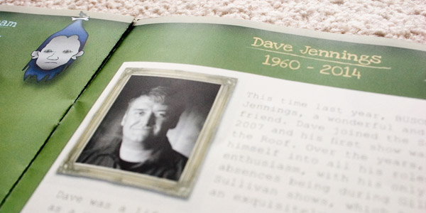
There’s a short dedication to a friend and alumni who sadly died last year (read more here). We chose to place a quote about death from Sir Terry Pratchett under it… Ironically Terry died a week later, on our opening night.
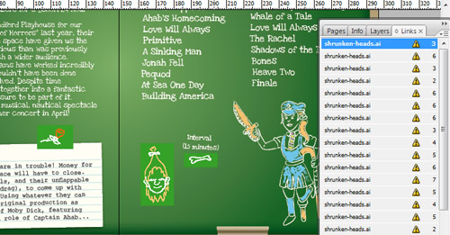
Now here’s an interesting cheat i’d like to share with you: This programme uses Image Sprites. A collection of images put into a single image, they’re usually used for websites, but InDesign lets you crop the visible area of an image, so they could work here too. Here’s the full sheet of props and many coloured underlines:
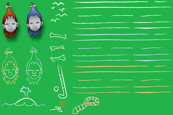
This let me use InDesign’s Place function to link to one file instead of 43. Of course, it still had one entry for each “crop”, which meant that whenever I changed a single image on one page, all the images in that sheet had to be refreshed in InDesign. But my Windows folder was a heck of a lot tidier.
For printing, the programme was laid out as two double-sided sheets of A4 – That basic paper draft came in handy for getting the pages in the right order here. The producer herself assembled them, folding the pages in half and stapling them down the spine. While there was no subsidy from advertisers, there was no real price difference for black & white printing, so unlike the Maskerade programme this one was full colour throughout.
Here’s a new kind of preview for you: Issuu makes it more like a booklet. Let’s give it a go!
A quick word about the show itself. Admittedly I had low expectations going in, but it turned out to be really funny. Part of this is from it’s play-within-a-play premise: The wonkier the set and the hammier the lines are delivered, the funnier it gets. And boy, was there ham and camp. You can read The Bradford Review’s critique online, via… oh, Issuu.
- BUSOM on the web
- BUSOM on Facebook
- BUSOM on Twitter