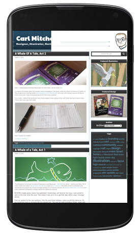
Google change their search criteria all the time. With more people now searching on their phones than on PCs, Google brought in a big new rule on April 21st: If your website isn’t mobile-friendly, you’ll suffer in search results.
I ran this site you’re on now through Google’s mobile test… yeah, I already knew what it would do.

Tiny hard to read text, miniscule hard to click links, and the background image mysteriously gave up.

Making it responsive (A bit of flexibility)
Back in the ’90s, webpages were just HTML files holding the content, and it was showing up on a desktop computer or going home. Later on someone added CSS (Cascading Style Sheet) files, which can define what the HTML content looks like. This is where we can make things flexible, or “responsive”, for all those different-sized desktop and portable screens we have now.
Responsive design is explained in-depth here, but (very) basically:
- Put conditions in your code (defined by @media), Eg. if the screen’s smaller than X, use code from section B instead of section A.
- Use relative measurements instead of exact ones. If your box is 500 pixels wide, what happens to it on a 400 pixel wide screen? Instead, tell that box to be 100% (of the screen) wide, and it’ll work thes rest out itself!
CSS Tricks and W3Schools are deathly useful here, and learning what something is called so you can Google it is half the battle!
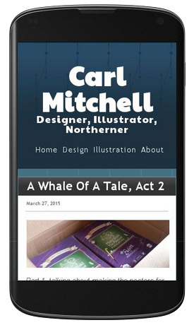
My site now has 2 templates: When space gets tighter it switches to a single-column layout, the text and buttons get bigger (with wider gaps between them), and images wider than the screen shrink to fit. I also made sure my portfolio galleries support touchscreens (they now use dFactory’s Responsive Lightbox plugin), and removed anything that depended on Adobe Flash to run – iPhones don’t support it, and everyone else is phasing it out.
If you’re on your computer, make the browser window narrower and see the change!

Trimming the fat (Every little helps)
Your potential visitor will abandon ship if a page takes too long to load. Make files smaller and your site will load faster.
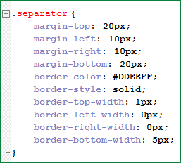
This piece of code may be easy to read, but it could be a lot shorter:

All those tabs, spaces and returns count when it’s being shipped around, and it’s not utilizing any of CSS’s shorthand. This does the same thing in less space:
![]()
While I was in there, I saw the remnants of my learning scattered throughout the file, so it got some much-needed housekeeping.
One class was in there twice; the first instruction was cancelled out by the second. So why have the first one there? DELETED.
Comments (annotations) are handy, but you can also use comment markers to disable code… and leave it in the file as dead weight. All the bits for my old “social media box” have been unused for over 3 years. BALEETED.

That comments trick was actually the easiest way to clean up – i’d disable a section, re-apply the CSS file, and if anything breaks, un-comment the section to re-activate it.
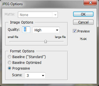
Images can come in different sizes too. When saving in Photoshop, GIMP or Paint.NET, there’s generally a quality slider that shows you how big your file will be. Get a good balance; you don’t want a smeared blocky mess. For GIFs and PNGS, you can use ‘Save For Web’ options to go further, and set the amount of colours too (though only a PNG-24 can have translucency)… it even gives you a preview.
You can also use an online tool like compressor.io.

In conclusion…
My backup file from before the refit is 907 lines and 23.5KB. Today it’s 443 lines and 21.7KB. Using CSS Minifier to put it all on one loooong line gets it down to 18.7KB.
Still a pittance to broadband, but better for a mobile user’s data plan, it looks right on their screen when it gets there, and each line of code is put to much better use!
