Lauren is an editor by day, author by night. An old friend, she’s been co-writing one of my (eternally in development) comics. Lauren’s been compiling a collection of short stories with her friends and peers, which is about ready to self-publish. The cover art was already sorted – I was called in for the publisher’s logo. That final pro touch in the bottom corner, you know?
Being fascinated with history and archeology, she decided on a Celtic style. Plenty of research was done via Google Images (filtering out the Scottish football team of the same name), finding a surprising amount of ancient finely-carved nudity.
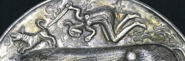
Click for the full uncropped image if you really want to see a bull’s, ahem, “bullocks”.
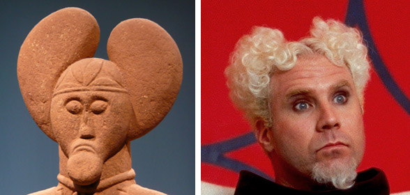
We agreed that a face / mask would be neat. Lauren liked the Lord of Glauberg statue… but the product needed to work on laymans like me. The Lord reminded me of Mugatu from Zoolander, so was vetoed.
Now THERE’S a comparison you didn’t expect to see today.
The winner of this round was a Celtic horned god of nature, known as… *checks spelling* …Cernunnos. That’s him at the top of this post, on the same artefact you can find that bull.
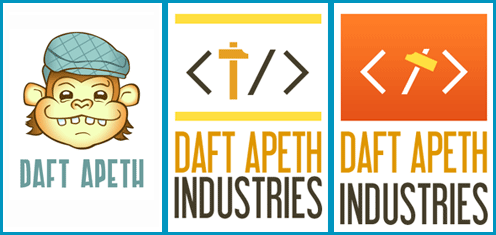
My brother is a web developer who lives down south. He’s doing so well that he’s starting up a Limited company to be his own boss: Daft Apeth Industries, a name he’s been using for years. Naturally knowing what I do, he called up and said I could help with his branding.
Starting out, I drew both humoured chimps in flat caps and self-closing HTML tags with hammers. Here are the neater ones:
Bit of a Soviet thing going on with the hammers and red.
Brother liked the font on the latter, and the ape on the former. The feedback was “make him less goofy and more angular”, in black and white or one-colour (clearer and saves on print costs)…
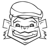
Stripping it back to the outlines, I challenged myself to re-draw the Apeth without using the Convert Anchor Point Tool (I love that little hollow cursor). Only straight lines. The result wasn’t too shabby…
One of my pastimes is to tinker with wikis. I amend text, fix references, apply cleanup tags, the usual. Sometimes images come into it: Hence today’s update.
For Wikipedia itself, it’s mainly been photo and diagram cleanup. The one i’ll highlight is the diagram on Xbox 360 technical problems, as it required some learning of EPS file formatting. And because i’m a PS3 owner. Teehee.
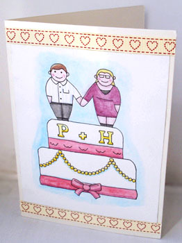
I’ve reached that age bracket where a lot of my friends are getting married. I made a card last winter for one couple who got hitched, and yesterday another pair tied the knot!
I’ve known Mr West for almost a decade, and the now Mrs West for nearly as long, so they most certainly had to have a homemade card too. This one is also a pen and watercolour work, yet there’s no imitation of famous artists this time around.
Deciding the inscription took some time.
This duo of feelies will likely become a trilogy, as there is one more wedding next month. The occasion is on May the Fourth, so stay tuned to see if I infringe on any Star Wars copyrights.
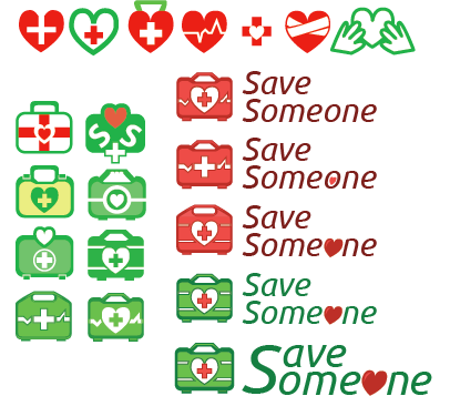
An acquaintance (who is already wed, for those keeping score) is branching out into his own first aid / CPR training business, and he knew I was the guy to hit up for a logo. Research showed that this kind of company always seems to use a combination of lovehearts, heart monitor lines and first aid crosses for it’s identity, so this one took a bit of a think to make more distinct. There was a heap of back-and-forth communication involved: Getting it down to case designs, then the decals, the colouring, selecting the font and word arrangment…
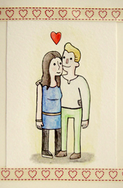
Also, a friend got married last weekend – the same one that received the social butterfly, if you’re keeping track of such things.
The card I handed to the groom at their reception sports a cheery watercolour of the newlyweds in Scott’s style. I haven’t used watercolours in a long time, so it worked out nicely for a “first go”!
Groom, if you have lost the card, I will tell Liam Neeson that you took his daughter.
Scott’s gonna have a table at the Thought Bubble comics convention next week: I’ll get him to sign my copy of his new Great Showdowns book, and maybe get to show him the above!
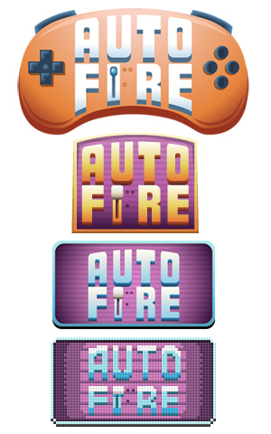
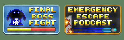
So, “expansion”? Regular client and friend Final Boss Fight – The video game news site has grown into a whole network! I didn’t brand A to Play (playthrough videos), and Pixel Gaiden (editorials) was straight-foward, but AutoFire (news feed) had a little journey. Observe:
The joypad buttons say “FBFN”, as in “Final Boss Fight Network”.
The top one was pretty unintelligible at small sizes, while the second one (originally with a red backing) looked like it should be hung outside a fire station. To give each site different colours, blue and purple came into play. Then it moved into the same frame-size as the main site and editorial logos, and finally, by request, pixelated to match the existing hub logo.
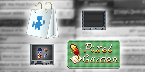
A bunch of other assets were cooked up too – a couple of CRT TVs, favicons, and a few pics to replace the stock ones on the network hub, including a quick shot of my games shelf and a Store image.
Pixel Gaiden is a Phoenix Down quill and Minecraft paper, by the way.
There’s one more logo, but the site’s not live yet so it’s still under wraps. It’s not pixular, I promise.
Random ending: I updated the mobile phone icon on my Contact page, because I haven’t used a phone with those things called “buttons” since 2010. The old one was a Nokia 3110c – It’s now an Orange San Francisco II.
Hi. So, how are you keeping? Around exchanging time for money, i’ve been doing these odds and ends.
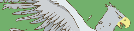
One picture, based on a scene from Harry Potter and the Prisoner of Azkaban, was mothballed in 2009 after reasonable progress but unsatisfactory results. Now it’s being reworked – The characters have been re-drawn, while the background and border are next. Quick preview:
A Hungry Hungry Hippogriff.
I also have a new typography piece based on Minecraft, uploaded to DeviantArt here. A black background looks fine but boring, whereas dark green makes it all a bit muddy. It currently lives in anticipation of a better solution being cooked up.
An ongoing thing has been the branding for games-and-comics news site Final Boss Fight. It turns out i’ve mentioned this before, but now the site’s running properly and i’ve made additional images. I even helped out with the camera work / logistics at the Manchester MCM Expo, which was nice.
The earlier examples have at last been added to the Illustrations page, along with a pic from my Puffin Digital Prize entry (see this post).
The Indie image is based on Commander Video, fact fans.
The second tick-over is again Minecraft-related (play it, it’s fun): A texture pack.
The textures default at 16×16, so it teaches pixel art & “economising” at the best of times. In addition, the pack i’ve been updating is in the style of the original Game Boy handheld: This means working in 4 colours. Some of the textures are taken from Game Boy games – some are modified from the defaults – some are completely new. Anywho, it is called CraftBoy, and this is where it lives.
This is the default texture pack…
…and this is what CraftBoy does.
Finally, this site’s seen a slight header update, code fixes and item shuffling, as always.
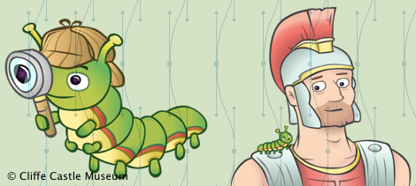
As covered in previous posts (and highlighted on the right), i’ve been heading a 2-part project to create a children’s mascot for Keighley’s Cliffe Castle Museum. Well, the second half of Cliffe the Caterpillar finally came to pass in March.
This chapter required more complicated / exciting imagery than the first. There was also a tighter deadline this time round, but it was still brought in on time!
Below are two of the five images made:
Cliffe as a great detective – Cliffe with Centurion
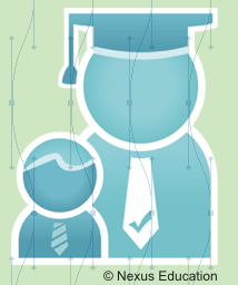
As I was working on the above, a second freelance project came in. An upstart called Nexus Education wants some branding and promotional material creating, and I started off by providing a logo:
An agency supplying and screening substitute teachers.
Then freelance disaster struck – I was offered one of these things called “a job”! No, it’s not in a design studio, and it’s temp ongoing, but I grabbed it with both hands!
So here’s the rub: Now i’ve had to put my involvement in the Nexus project on hold, and can no longer help the 3D group mentioned last time (not for a while at least). Shame.
I can, however, afford to buy more than food now, and it’s not a bad place. Onwards for a wage!
Logopolis was taken. So was Logopalooza. Besides, I think you need more than three to use those terms. Onwards!
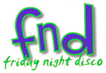
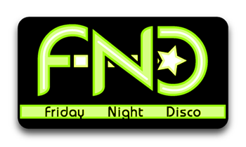
Over the Single Positive Integer Increment of Gregorian Calendar Occasion (New Year’s) the University of Bradford Students’ Union ran a contest to redesign their “Friday Night Disco” logo. Since for the last couple of years they’ve been using this…
Old & Busted.
…I thought it couldn’t hurt to enter. Equal parts crafting and waiting later, I won! This is what they’ll use now:
New Hotness.
I was generally thinking of glow-sticks and star wands.
They were so eager to get going that the image was put to use a few hours after the contest deadline! My reward is free entry into any of their events (including the FND of course) for the rest of the academic year – something to bear in mind when passing through the city. The slight profile rise and achievement feel grand.
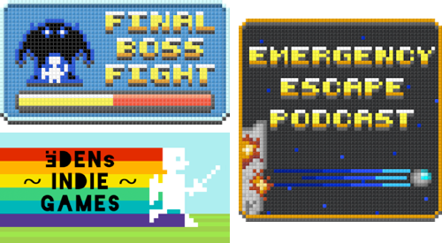
Part two of two: My associate Filmstock is part of a brand new collaborative that blog about video gaming (they met working at GAME). Final Boss Fight is being knocked into shape, and as some retro identity imagery was requested, I once again sallied in!
Website logo (left) – Podcast logo (right)
Mmm, pixels.
Oh yes, there’s an accompanying podcast too. I like the name. The podcast logo needs a little re-jigging to meet Apple standards, but the current one can be used on Filmstock’s site just fine.
I’ve that many logos to show off now, they may need to break off into their own portfolio page (or some lessers need culling).
Part three of …two. A little tinkering means I can give blog images captions now. A nice feature to have. I might go retcon some into older posts. Tata.
This post title was brought to you by The Nightmare Before Christmas.
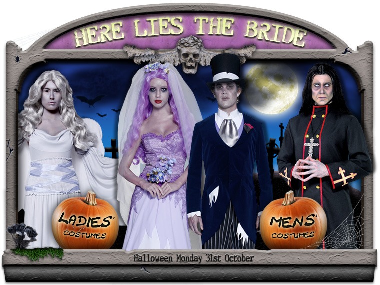
One of the last months highlights has been applying to a company that sells fancy dress costumes online. They’re genuinely nice people, so here’s a link to them. Sadly, that application goes no further; I gave 125%, and someone else gave 150%. I can now show you some of my application project.
We were given one week to create a bunch of specified assets. Themes were picked from a hat – mine was Halloween. Score!
A ‘shop window’ splash image, to highlight some male and female costumes:
Codename “Dead Wedding”, it’s loaded with gravestones, bats, pumpkins and other seasonal paraphernalia. The costumes are for sale on their site. Insider tip – the black flowers in the lower-left corner are also available for purchase.
A matching banner was built too.
Also, a re-design of the site logo:
Notice how the whole thing is enclosed in a box, to represent their delivery service. The shiny look imbues glamour and fun, as the current logo does, while the choice of accessories shown (pirate hook, fake moustache) show that the site is not just for girls.
Progress through the concepts below:
As you may have noticed, Halloween is not the season we’re currently in. Let’s end on a festive note. I may get coal in my stocking this year, but that’s OK – there’s a wood burner in the living room, it’ll help get the fire started. HO HO HO.
A scant few days after my last post, I was offered a commission!
Cliffe Castle museum are revamping their materials, including the boards for a nature trail. They decided that their rather “dry” images for the children’s sections weren’t cutting it anymore. “Cliffe the Caterpillar” would be born!
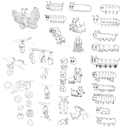
Initial sketches. Caterpillar #9, ‘The Devil’s Hotdog’, was quickly dismissed.
The first stage of this project was to produce images of a caterpillar’s four life stages… to go on the five information boards. Ah. Easily solved by adding “emerging from chrysalis” as the fifth picture.
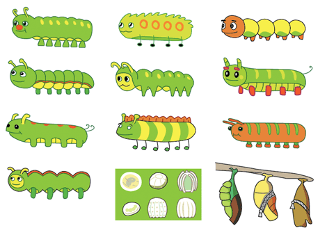
I provided some rough inks of a range of caterpillars, eggs and chrysalides to choose from, allowing them to mix & match parts for their ideal mascot. Once the final design was sorted, the chosen images could be polished up supremely.
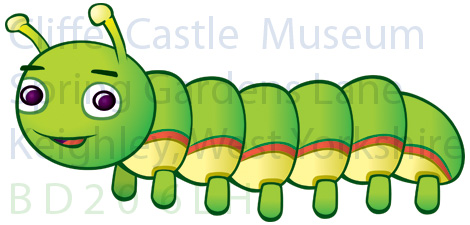
We’re still hammering out who owns the rights to the final images, so i’ll play it safe and show you one Cliffe, a bit faded & through a watermark:
The project continues into October, with the creation of Cliffe reading a map, eating leaves and suchlike.
*Yes, that does mean there is Cliffe The Caterpillar The Butterfly. Don’t be too logical.