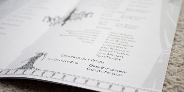
In my last post I mentioned that I had many tasks for the New Bradford Playhouse’s in-house production of Maskerade. Last time we talked posters. Today, we focus on the programme.
A 12-page booklet, the whole thing was designed to be printed in black and white on ordinary office paper. The audience got such a version, while I gifted some cast and crew members this borderless, colour cover variant. It contains the usual suspects: a synopsis, cast list, crew list, rights, a word from the director, a bit about the theatre and what’s being performed there next. A nicety is that being an internal production on a shoestring budget, there’s no advertisements. The cast pages ended up being the centre spread, which was ideal.
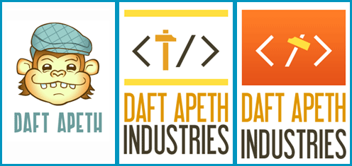
My brother is a web developer who lives down south. He’s doing so well that he’s starting up a Limited company to be his own boss: Daft Apeth Industries, a name he’s been using for years. Naturally knowing what I do, he called up and said I could help with his branding.
Starting out, I drew both humoured chimps in flat caps and self-closing HTML tags with hammers. Here are the neater ones:
Bit of a Soviet thing going on with the hammers and red.
Brother liked the font on the latter, and the ape on the former. The feedback was “make him less goofy and more angular”, in black and white or one-colour (clearer and saves on print costs)…
Stripping it back to the outlines, I challenged myself to re-draw the Apeth without using the Convert Anchor Point Tool (I love that little hollow cursor). Only straight lines. The result wasn’t too shabby…
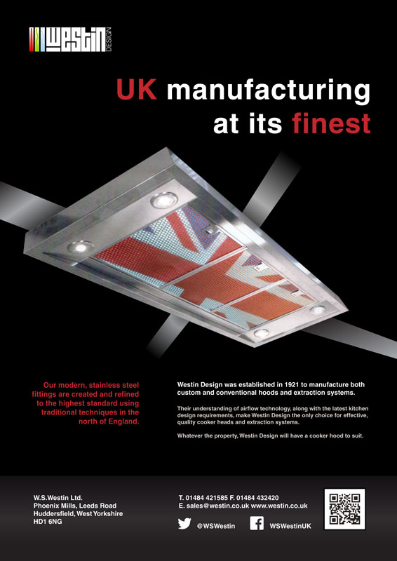
As per usual in a design company trial, a bit ago I had to make a layout out of supplied assets. I got to keep an A3 printout as a souvenir; as that memento is a bit crinkled, attracts dust, and doesn’t fit in my scanner, I quickly recreated a neater pic for you:
Behold, the site is refreshed! The visual shift came about as this blog is now powered by WordPress. There’s a reason it’s one of the top names in Content Management Systems: It sees a heck of a lot more updates, support and plugins than my previous CMS, Habari. Everything has been ported over except the comments, and there may yet be an injector for those. All in all, I like it.
If you want an update with a picture in it… my deviantArt account passed 7,000 pageviews a few days ago. I did a comic for 2, 3 and 5 thousand views – The 7,000 views comic, featuring old character Super Turnip, is now up.
Update: Off The Market was been accepted, and voting is now closed.
Threadless is arguably the most famous t-shirt site. Artists submit designs, either in general or as part of themed contests, which are then voted upon for a chance to join their product line. They’ve expanded into further clothing, wall art, cards, phone cases… good fit, good quality and good designs.
After posting earlier this month about all those cards I made, a Threadless newsletter had a word in my ear, introducing the contest Greeting cards II. T’was a sign!
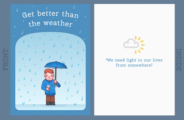
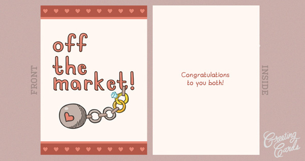
I’ve tidied up two cards which are featured on my portfolio pages, but have only been mentioned in passing. Get Better Than The Weather was a Get Well Soon card for a work friend, while Off The Market was a Valentine’s Day card for a newlywed, but for the purpose of the voting is a Wedding congratulatory card.
Both are now up for scoring on Threadless for the next 9 days (until about the 6th of June). Click a link or picture below to hit ’em up high, why don’t you?
Yes, today’s theme is layouts: Recently I put together a few new compositions, and polished up a couple of older ones.
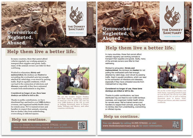
When it comes to publishing software, there’s essentially two rival firms: Adobe (them of Photoshop) make InDesign, while Quark produce QuarkXPress. I haven’t used the latter for a long time, so I was sure to roughly re-create at least one of these ID works in QXP, looking up how to do particular actions when required. While features like arranging items forward/backward have yet to be discovered, it served as a good refresher task.
So, play the gallery theme in another tab and scroll down: You can click on any of the images for a larger view.
InDesign version on the left, Quark practice on the right. The Donkey Sanctuary’s website has a pleasing colour scheme, which has been carried over to this. I also used a method from The Sun newspaper, in that specific words are made bold for emphasis.
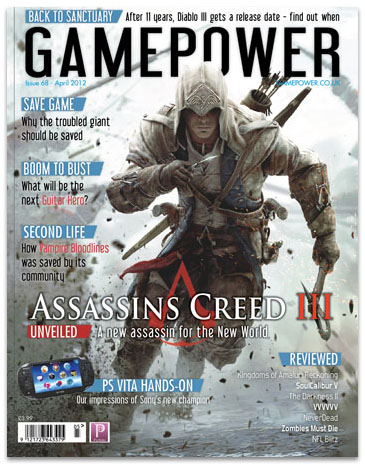
Moving on to this magazine cover, there’s a lovely triple meaning in the cover line “Second Life”: First off, it’s the name of an unrelated but well-known video game. Secondly, Vampire: Bloodlines is based around Vampires – creatures in their ‘second life’. Finally, Bloodlines has been given a new lease on life since the development studio closed, as fans fixed bugs and restored incomplete content!
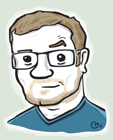
This month, the time rolled around again to get my eyes tested, find out how short-sighted I am now, and consequently purchase a new pair of glasses. There were a few days of mis-judging distances and staring at the rims, but now they’re being cool. This was a big enough change to do an update of my self-portrait, which was last altered in 2010 (when I previously bought new eyewear). Behold!
One of the places this guy lives is up in my site header, giving you a bit of a DreamWorks Face every time you come here. Here’s a comparison with the previous version:
Sadly, I had to delete some hair. Still being a little generous here.
I’ll have to update the photo on my Contact page too, as it’s showing it’s age (ironically by not showing mine).
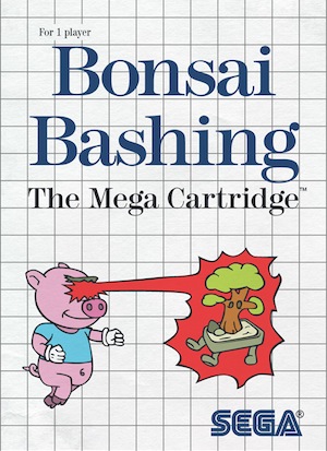
So, around confronting my own mortality (well, inching closer to 30), more contributions are underway for friend and regular subject Final Boss Fight. In their 48th podcast, they discussed how Super Mario Bros. has such a bonkers premise. They started throwing words together to highlight this: What about a monobrowed pig with laser eye powers, saving his friends (magically transformed into Bonsai trees) from an evil Architect?
Hey look, it’s come to life as boxart!
I had a Master System myself. Pro Wrestling, Olympic Gold, Rampage… ah, memories.
Try as I might, it still looks better than the official cover Alex Kidd in Miracle World had. If you click the above image it’ll take you to the DeviantArt page, where you can download it in various wallpaper sizes (with an FBF logo replacing Sega’s).
To keep to the rule of three, I have one or two sketches that could expand into a project. Tease!
Final thought: I live in the UK, and it’s a Bank Holiday (3-day) weekend. Of course, after a working week of clear skies, it’s rained every day.
February was a busy month: After Hourly Comic Day (see previous post), I had a project to return to.
The Puffin Digital Prize 2011 is not so much a prize as a contest. Running from late November to February 28th, the brief was to storyboard a children’s picture book… for iPad. At least 2 spreads had to be fully finished, while the rest could be rough layouts & sketches.
The submission guidelines contradicted themselves, there was no hotline, and the hot-email-address server broke. Nevertheless, I persevered and got it done!
The end result is 775 words, with 9 finished images (6 complete pages), 24 doodles, and a pile of digital post-it notes.
No, you can’t see it yet.
…Alright, i’ll give you one image (and not the best one):
I should explain, it’s about unconventional dog racing.
This contest also reintroduced me to Fineliner pens – I was a fool to ever let them go.
Here’s hoping for a shortlisting!
And now, on to the second item. A man in Hebden Bridge is taking a year out to teach himself and others about 3D filming, and he hopes to get a project going. Here’s his article from the local paper last week.
I went to the first meeting on Tuesday – he’s a thoroughly nice chap who knows his stuff, and you should have seen the test footage!
There’s some of this, but it’s mainly about the new, better 3D.
I’ve passed his article on to my old uni lecturer (now the Dean of Computing), to see if any undergrads are interested. If you’re interested, give H. Clegg a shout!
This post title was brought to you by The Nightmare Before Christmas.
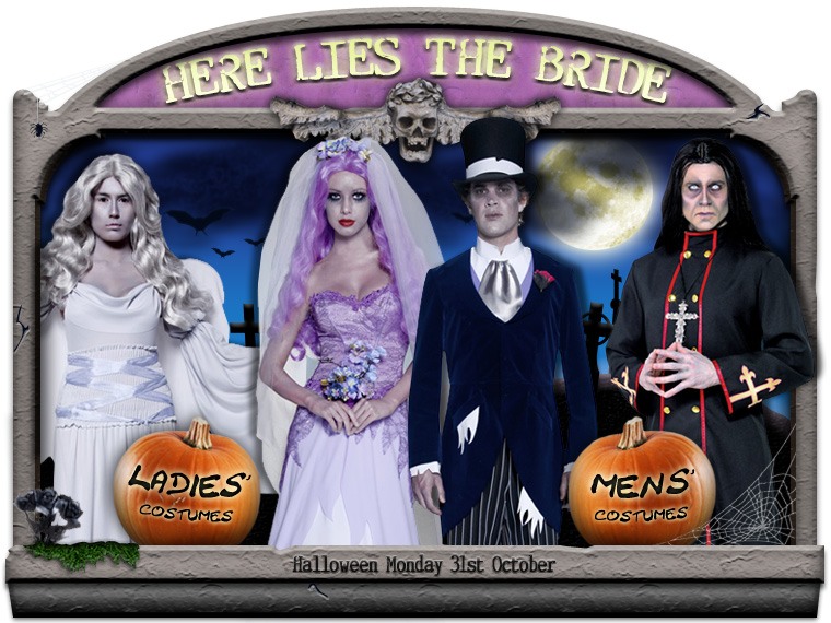
One of the last months highlights has been applying to a company that sells fancy dress costumes online. They’re genuinely nice people, so here’s a link to them. Sadly, that application goes no further; I gave 125%, and someone else gave 150%. I can now show you some of my application project.
We were given one week to create a bunch of specified assets. Themes were picked from a hat – mine was Halloween. Score!
A ‘shop window’ splash image, to highlight some male and female costumes:
Codename “Dead Wedding”, it’s loaded with gravestones, bats, pumpkins and other seasonal paraphernalia. The costumes are for sale on their site. Insider tip – the black flowers in the lower-left corner are also available for purchase.
A matching banner was built too.
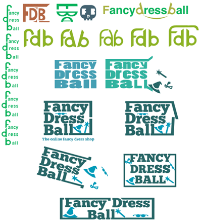
Also, a re-design of the site logo:
Notice how the whole thing is enclosed in a box, to represent their delivery service. The shiny look imbues glamour and fun, as the current logo does, while the choice of accessories shown (pirate hook, fake moustache) show that the site is not just for girls.
Progress through the concepts below:
As you may have noticed, Halloween is not the season we’re currently in. Let’s end on a festive note. I may get coal in my stocking this year, but that’s OK – there’s a wood burner in the living room, it’ll help get the fire started. HO HO HO.
A scant few days after my last post, I was offered a commission!
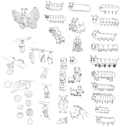
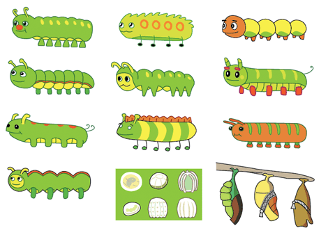
Cliffe Castle museum are revamping their materials, including the boards for a nature trail. They decided that their rather “dry” images for the children’s sections weren’t cutting it anymore. “Cliffe the Caterpillar” would be born!
Initial sketches. Caterpillar #9, ‘The Devil’s Hotdog’, was quickly dismissed.
The first stage of this project was to produce images of a caterpillar’s four life stages… to go on the five information boards. Ah. Easily solved by adding “emerging from chrysalis” as the fifth picture.
I provided some rough inks of a range of caterpillars, eggs and chrysalides to choose from, allowing them to mix & match parts for their ideal mascot. Once the final design was sorted, the chosen images could be polished up supremely.
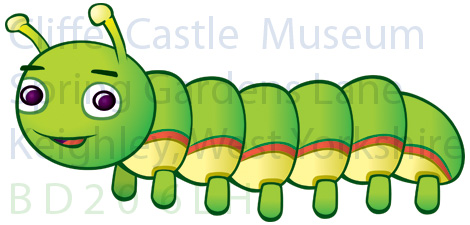
We’re still hammering out who owns the rights to the final images, so i’ll play it safe and show you one Cliffe, a bit faded & through a watermark:
The project continues into October, with the creation of Cliffe reading a map, eating leaves and suchlike.
*Yes, that does mean there is Cliffe The Caterpillar The Butterfly. Don’t be too logical.