
Lauren is an editor by day, author by night. An old friend, she’s been co-writing one of my (eternally in development) comics. Lauren’s been compiling a collection of short stories with her friends and peers, which is about ready to self-publish. The cover art was already sorted – I was called in for the publisher’s logo. That final pro touch in the bottom corner, you know?
Being fascinated with history and archeology, she decided on a Celtic style. Plenty of research was done via Google Images (filtering out the Scottish football team of the same name), finding a surprising amount of ancient finely-carved nudity.
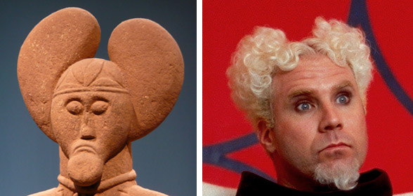
We agreed that a face / mask would be neat. Lauren liked the Lord of Glauberg statue… but the product needed to work on laymans like me. The Lord reminded me of Mugatu from Zoolander, so was vetoed.
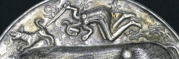
The winner of this round was a Celtic horned god of nature, known as… *checks spelling* …Cernunnos. That’s him at the top of this post, on the same artefact you can find that bull.
Round 2 – Drawing a few heads: More Aztec than Celtic, as they’re based off this article’s simple Celtic sandstone statue (what alliteration!), but good to go with.
#AmDrawing Celtic faces. Archaeological ones, not football-icle. Love me some logo making. pic.twitter.com/xYtoynCY0X
— Son of a Mitchell (@MaligreesGarden) March 26, 2016
I picked the smudgiest drawing (then threw away the rubber), cleaned it up in Photoshop, and moved everything around.
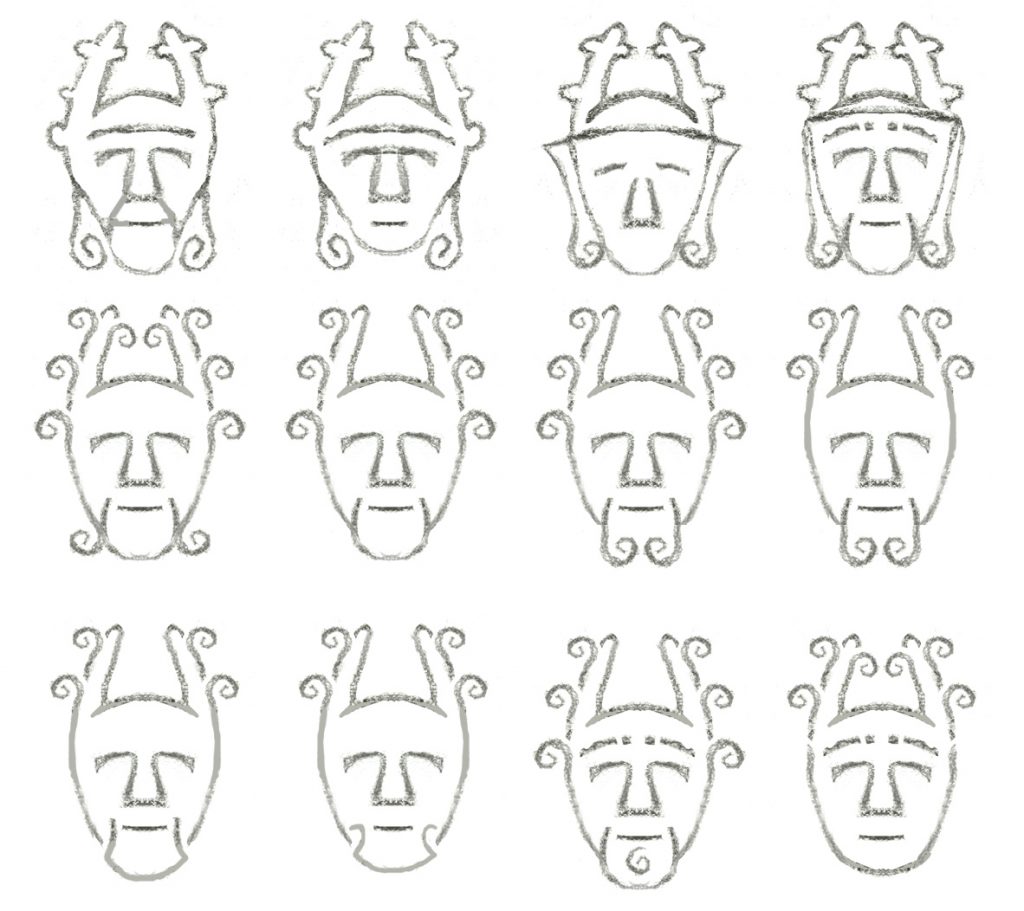 Some of the ironworks in the research had flowing beards, giving them a Poseidon flavour. For some reason I kept making goatees, which combined with the horns made it look like Batman (or even Ra’s al Ghul in Batman Begins).
We wanted to get in the star i’d made for another project (centre of below image), but it was too complex. So were the assorted Celtic knots and stars. Celtic markings are inherently intricate, while the novels on my bookshelf fit their publishing house logos with a couple of centimetres. Or less. ‘Legible at small sizes’ is important here.
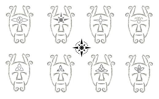 I chose the top-right symbol – a representation of the Torc and Serpent that Cernunnos is usually pictured with. Finally going all-in with vectors, this was what came to be…
 …but after sleeping on it, I went back in to see if I could better.
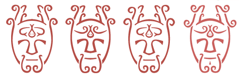 I changed where the lines tapered and thickened. The shape of his face. A soul patch / philtrim came and went. Tried to stop the antler tips looking like peeled bananas. The curves on his horns (the tines) went upside down at one point. I like that in #3 above, you can draw one continuous line through the outer tines (branches) and the beams (trunk). They ‘line up’.
The tweaking snowballed into an overhaul. Gave him a shave, re-drew the antlers again, made everything more smooth (natural) and androgynous, and tilted the head down slightly to elongate the antlers.
I also played around with a dozen fonts, but we’ll skip that step.
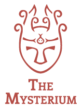
This is the final result!
 Graceful.
Made a few sizes, a few colours, a small one for the website header, emailed them over, stored and backed up the master files. And we’re done!
- Lauren K Nixon (Author’s website)
- Title Not Included – An Ensemble of Short Stories (Coming soon)
P.S.: While my site doesn’t have an affiliates list on my site, I’ve made it onto hers. Nice.
P.P.S: You have no idea how many times I avoided mentioning this song while writing this post, so there’s your YouTube link.