Considerations of the Alphabet

There was a picture my brother used to have. It was his name, with the letters surrounded by Gnomes, or Gnomes hanging off them. A personalised image. You see mugs and keyrings all the time, all the same pattern, just with different children’s names on them.

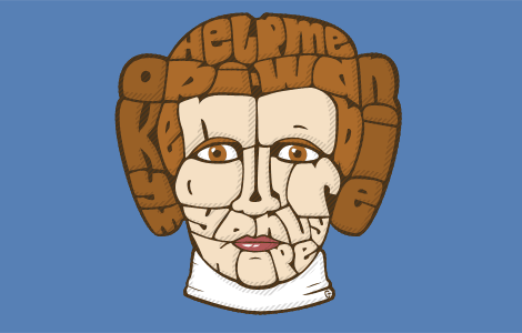
Consider the following image, which I have made, and which has taught me several things in its creation.

Chloe Safari - Click for larger image

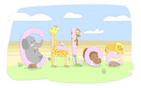
Chloe is my second cousin. Her father is from England, but she lives in South Africa, so the above image features animals from the region. Research: Obviously you won’t get a Koala in S.A., but you do get Penguins.

The image above has the animals at random. As H is not for Giraffe (shame, it fits the shape nicely), some educational folks might want the animal lined up with it’s corresponding letter. Restricting the region is just asking for trouble – there’s a lack of African animals beginning with X – but when considering the audience of this piece, do you line the animals up with their English initial, or their African name? In England it may be M for Monkey, but down there it’s A for Aap (pronounced ‘arpy). As a side note, this is also why most animals in pictures such as these aren’t fully entwined with their letter – you can’t fit a Wildebeest into a W without ruining it’s skeleton.

There is also efficiency. If you want a mix-and-match theme, so any name can be put together, you have to create images for all 26 letters. If you want lowercase letters (as above), you have to double that. Going worldwide could easily drive a man to madness, with accented letters, minor punctuation, cyrillic lettering, even hebrew or kanji to cater for, before you dared to assign the correct letter to an animal for it’s language.
No wonder all the ones i’ve seen are English and all in capitals.

I have the urge to try again, but with an overall less demanding theme… and not matching the initial.

Send out a Clacks

It’s another Friday update!

Terry Pratchett’s Discworld; one of the very few novel series i’ve read from start to finish. Love ’em. There’s a dedicated Wikipedia for many things, and these books have one.

The picture they had for a Clacks (a Semaphore tower) is, in a word, awful. So I thought i’d wade in and bring a nicer one to the table.
I made two.

Carl Mitchell's First Clacks Tower - Click to enlarge

I started drawing this “technical” one first. Realising that the thin lines and angle would make it unclear at a low resolution, I soldiered on none-the-less, and decided to draw a second, smaller, rougher one to make up for it.

Carl Mitchell's Second Clacks Tower - Click to enlarge

I actually prefer this smaller one. It must be the shading.

Land of Trees

Been busy.

This is finished: An idea that’s been rattling round my brain for years, all wrapped up with an Illustrator CS3 bow!

Land of Trees - Thumbnail - Click for full view

In upcoming news, when my printer decides to print more than off-red stripes, or when a reasonably priced print shop is found, a long-running project (one that’s a slight departure from the usual) will be completed…

iDraw

Now that lame pun is out of the way, here’s the content. Not my usual style, but below are two vector creations, both of them Apple music players.

Carl Mitchell's iPhone and iPod nano illustrations

The iPod nano (left) was drawn last year, to feature on its Wikipedia page. It lived there for a heartwarming 3 days, 3 hours and 37 minutes before a grander (yet oddly similar looking) image replaced it. See it archived here.

I’m posting it now because the iPhone illustration (right) is new. It was made for a totally different reason – a possible surround for the TimeLock app example on my design page. It could make that image huge, so we’ll see, but doesn’t it look pretty?

Three Parties

The UK General Election Day is here! Today the three main political parties are fighting for dominance. I voted by post – No, I won’t tell you who for, but i’ll let you see what i’ve produced:

Three Parties - click to enlarge

One of my first shots at caricatures went off OK!

It’s actually a portrait image, with a little more at the top & bottom than you see above – Click on it for the full image, at a higher resolution!

Tweet Tweet

You know what’s all the rage these days? Twitter. I’ve been on it for a year or so now, and while updating the social media links on this site, the Twitter bird is getting special attention.

Carl's Twitter icon
Yes, those glasses are a near-replica of my own.

I did design an infobox to display the latest tweets, but as they’re not overly professional perhaps just a link is best. It means that lovely image can be larger too. I’ll let you take a peek at what could have sat under the design link on the right:

Carl's Twitter update box

Leiapography: Double Dipping

Princess Leia Organa joins the Star Wars Typography lineup (after Admiral Ackbar and Darth Vader), not once but twice! The first one is a regular bust…

Leiapography (Regular)

…while the second one is the “Hologram Edition”, with a blue tint and added hood.

Leiapography (Hologram)

Both bear the discreet inscription “Help me Obi-Wan Kenobi, you’re my only hope”. Click on the images to see them larger at DeviantArt!

Vaderpography

Vaderpography - Click to enlarge

Voila! The second “Star Wars Typography” work has arrived!

There could be a whole series of these, if the kinks can be worked out. Ackbarpography is doing well, being available to buy from SplitReason and all. There’s this one. Princess Leia is upcoming… sadly, she’s looking mostly dead right now!

Ghostbusters, Monkeys and Smoking Jackets

Did you think you’d see those three things together this morning?

Recently I joined a small group of candidates, applying to illustrate an “epic poem”. The ringmaster sent each of us an excerpt, requesting a couple of sample images in return. Here are my two submissions:

Old Egon (thumb)

Suave Monkey (thumb)

Why you’re seeing them now? Well, the email I received last night states that I didn’t get the contract. At least that means these images are totally my property.

Trash Can Cuisine

Trash Can Cuisine - click to enlarge
A.K.A. “Streets of Lunch”.

Here’s my latest entry into the SplitReason voting pool… can you guess the video game reference?

Streets of Rage, the old Mega Drive beat-em-up videogame. All the items pictured are either health pickups or weapons available in the game – The tagline for this image is “all I need is a fork”.