Northern Monkey

My brother is a web developer who lives down south. He’s doing so well that he’s starting up a Limited company to be his own boss: Daft Apeth Industries, a name he’s been using for years. Naturally knowing what I do, he called up and said I could help with his branding.

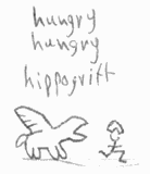
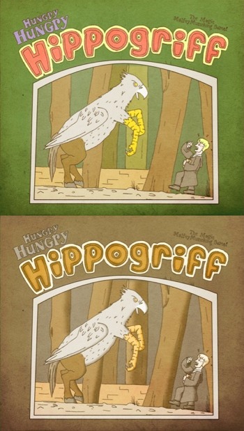
Starting out, I drew both humoured chimps in flat caps and self-closing HTML tags with hammers. Here are the neater ones:

daft134
Bit of a Soviet thing going on with the hammers and red.

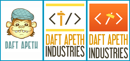
Brother liked the font on the latter, and the ape on the former. The feedback was “make him less goofy and more angular”, in black and white or one-colour (clearer and saves on print costs)…

Stripping it back to the outlines, I challenged myself to re-draw the Apeth without using the Convert Anchor Point Tool (I love that little hollow cursor). Only straight lines. The result wasn’t too shabby…

daft-angular

Pixel Polygon Pushers

Many are celebrating the start of the eighth generation of video games consoles today, with the launch of the PlayStation 4 in the US… seemingly ignoring that the Wii U was released last year. On this frabjous day, i’ve decided to share my gaming machines icons pack.

Sony console icons
Sony consoles say Hi.

I started the pack years ago to use with emulators and practise my pixel art. Initially drawn up for 256 colours and 32×32 dimensions, they don’t use that old Windows standard colour palette now, yet the CDs are the only icons that go over 32 colours, and the only ones which took anything more than the Pencil tool to create.

I have a few older revisions kicking around, so can show you some improvements that came with time:

Old and new console icons
Left sides: ’09 or earlier. Right sides: ’13.

Busy Bee

It’s my dad’s birthday this weekend. He’s been retired for a few years now, but is always up to something, he’s not the idle sort. For the last couple of months he’s gone to meetings about bees. He’s bought a bee-keeping suit, but there’s no hive in the garden… yet.

While mum considered digging Bizzy Buzzy Bumbles out from the attic, I made this. The inside reads “Dad-Bee Birthday!” (there’s a reason I didn’t write “Bee-Day“).

Dad-Bee Birthday Card
Yes, Dad has a moustache. No, he doesn’t have wings.

Hand-drawn then coloured with crayons, the bumble bees are raised from the card slightly on paper blocks. The day before gifting it, I happened across a YouTube tutorial to make wiggle-springs for cards: I carefully prised Dad Bee off and re-applied him with one of those installed!

p.s. Admins: I’ve added a captcha plugin for comments. Should help.

Food That Fought

You may have seen that Youtube had a redesign: They call it One Channel, and it provides a more unified experience across a few different platforms. One consequence of this is that whether your YouTube channel is on a computer, phone or television, it uses different parts of one large backdrop.

YouTube One Channel background specifications
Here’s the template people have to work with.

I don’t really use my YouTube account for projects any more, as i’ve sidled away from video and 3D animation projects (the ancient ones are still there and on Vimeo). John and the Final Boss Fight team do though…

Captain Crumpet - click to enlarge

Thread Count

Update: Off The Market was been accepted, and voting is now closed.

Threadless is arguably the most famous t-shirt site. Artists submit designs, either in general or as part of themed contests, which are then voted upon for a chance to join their product line. They’ve expanded into further clothing, wall art, cards, phone cases… good fit, good quality and good designs.

After posting earlier this month about all those cards I made, a Threadless newsletter had a word in my ear, introducing the contest Greeting cards II. T’was a sign!

I’ve tidied up two cards which are featured on my portfolio pages, but have only been mentioned in passing. Get Better Than The Weather was a Get Well Soon card for a work friend, while Off The Market was a Valentine’s Day card for a newlywed, but for the purpose of the voting is a Wedding congratulatory card.

Both are now up for scoring on Threadless for the next 9 days (until about the 6th of June). Click a link or picture below to hit ’em up high, why don’t you?

Get Better Than The Weather - click here to go vote

Off The Market

Wiki Walk

One of my pastimes is to tinker with wikis. I amend text, fix references, apply cleanup tags, the usual. Sometimes images come into it: Hence today’s update.

For Wikipedia itself, it’s mainly been photo and diagram cleanup. The one i’ll highlight is the diagram on Xbox 360 technical problems, as it required some learning of EPS file formatting. And because i’m a PS3 owner. Teehee.

xboxfail-sidebyside
Left: Before. Right: After.

Matrimony Triptych

May 4th 2013 starred the third wedding i’ve attended in six months. I mentioned these upcoming nuptials when showing off the last wedding card i’d crafted… you can see where this is going.

Turner's Card
Being Doctor Who fans, Mr Turner’s holding a Sonic Screwdriver.

As the Turners had been raving about Matilda the Musical, their card is in the style of Quentin Blake, famous for illustrating Roald Dahl’s children’s books. Like the time I made that Master System cover, it was interesting to actually try and reduce proficiency, making lines sloppier and slipping some colour outside them.

Lay Layout Lay

…Lay across my InDesign spread.

Yes, today’s theme is layouts: Recently I put together a few new compositions, and polished up a couple of older ones.

When it comes to publishing software, there’s essentially two rival firms: Adobe (them of Photoshop) make InDesign, while Quark produce QuarkXPress. I haven’t used the latter for a long time, so I was sure to roughly re-create at least one of these ID works in QXP, looking up how to do particular actions when required. While features like arranging items forward/backward have yet to be discovered, it served as a good refresher task.

So, play the gallery theme in another tab and scroll down: You can click on any of the images for a larger view.

Donkey Sanctuary posters

InDesign version on the left, Quark practice on the right. The Donkey Sanctuary’s website has a pleasing colour scheme, which has been carried over to this. I also used a method from The Sun newspaper, in that specific words are made bold for emphasis.

d-t-gamemag

Moving on to this magazine cover, there’s a lovely triple meaning in the cover line “Second Life”: First off, it’s the name of an unrelated but well-known video game. Secondly, Vampire: Bloodlines is based around Vampires – creatures in their ‘second life’. Finally, Bloodlines has been given a new lease on life since the development studio closed, as fans fixed bugs and restored incomplete content!

Commitment, Salvation and Diction

I’ve reached that age bracket where a lot of my friends are getting married. I made a card last winter for one couple who got hitched, and yesterday another pair tied the knot!

I’ve known Mr West for almost a decade, and the now Mrs West for nearly as long, so they most certainly had to have a homemade card too. This one is also a pen and watercolour work, yet there’s no imitation of famous artists this time around.

Wedding Card for Mr & Mrs West
Deciding the inscription took some time.

This duo of feelies will likely become a trilogy, as there is one more wedding next month. The occasion is on May the Fourth, so stay tuned to see if I infringe on any Star Wars copyrights.

An acquaintance (who is already wed, for those keeping score) is branching out into his own first aid / CPR training business, and he knew I was the guy to hit up for a logo. Research showed that this kind of company always seems to use a combination of lovehearts, heart monitor lines and first aid crosses for it’s identity, so this one took a bit of a think to make more distinct. There was a heap of back-and-forth communication involved: Getting it down to case designs, then the decals, the colouring, selecting the font and word arrangment…

Save Someone logo - highlights of progress
Just some of the options exchanged by email.

Hunger sated

Some personal projects run straight through, quick as a flash. Others get put on hiatus. Many sketches never get off the ground. Today’s post is about one particular illustration of mine; one that has made it through development hell to see the light of day.
After watching Harry Potter and the Prisoner of Azkaban for the dozenth time, and laughing at that brat Malfoy getting clawed after provoking dangerous animals, this doodle of a cheap pun landed in the sketchbook.

Hungry Hungry Hippogriff - first doodle
Timestamped – lawks! – March 1st 2008.

I sourced visual references of both the film and the board game referenced, and drew it out A4-sized while I was freelancing: I distinctly remember working on this while at the Saatchi & Saatchi offices. Scanned it in, did some digital colouring, applied filters and textures while playing around with the colour scheme…

Hungry Hungry Hippogriff - 09/10 colour options
The lower colour option being “contemporary video game”, apparently.