Catalogues, not Catalogs

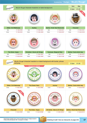
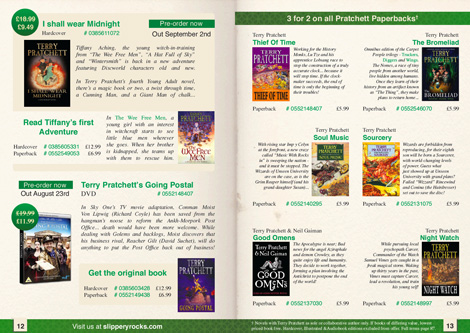
This week, I present two catalogue layouts, made while practicing. The first one (Moulin Rouge badges) is a single right-hand A4 page, while the second (Terry Pratchett books) is an A5 2-page spread.

A few things I have learned while working on these:

  • It’s amazing how much more artboard you have working in print.
  • I now completely understand Bleed and Slug.
  • Products in the outer corners of a spread get the most attention.
  • InDesign’s colour managed system is a bit tricky.
    • Although LAB is not a bad alternative to HSB.
  • Adobe Acrobat can’t export anti-aliased images.
  • My printer is still terrible and a liar.

Alright, have a looksie. Click to visit the larger versions, of course.
The badges one:

Badge Catalogue page - Click to enlarge

…and the books one:

Book Catalogue pages

p.s. It’s “Catalogues” because that’s the British spelling.

Jailbreak

A Wednesday update – weren’t expecting that, were you?

It’s back to designing this week; Illustrations have had a good run for a bit.

Bradford University has a Student Union that puts on plenty of events. While their website and posters are vibrant and full of colour, they make me feel a bit ill with their colour choices and production values.

So, my latest target: The 2010 “Jailbreak” logo and poster. This is what was plastered up all over campus:

UBUonline's Jailbreak 2010 poster

And, well, this was my reaction:

Phoenix Wright Shocked - Animated GIF

My revamped (and unofficial) result is below…

Jailbreak 2011 - thumb

…perhaps I went a little overboard with the brown, which could detract from the poster’s attention-grabbing power from a distance. It does have meaning though – It’s a deliberate callback to the look of those old sailor’s maps (like the ones pirates used) and the old wanted posters (think Westerns and Oh Brother, Where Art Thou?). It also allows people to focus on the information over it, nicely prison themed.

Tweet Tweet

You know what’s all the rage these days? Twitter. I’ve been on it for a year or so now, and while updating the social media links on this site, the Twitter bird is getting special attention.

Carl's Twitter icon
Yes, those glasses are a near-replica of my own.

I did design an infobox to display the latest tweets, but as they’re not overly professional perhaps just a link is best. It means that lovely image can be larger too. I’ll let you take a peek at what could have sat under the design link on the right:

Carl's Twitter update box

Trash Can Cuisine

Trash Can Cuisine - click to enlarge
A.K.A. “Streets of Lunch”.

Here’s my latest entry into the SplitReason voting pool… can you guess the video game reference?

Streets of Rage, the old Mega Drive beat-em-up videogame. All the items pictured are either health pickups or weapons available in the game – The tagline for this image is “all I need is a fork”.