
…Lay across my InDesign spread.
Yes, today’s theme is layouts: Recently I put together a few new compositions, and polished up a couple of older ones.
When it comes to publishing software, there’s essentially two rival firms: Adobe (them of Photoshop) make InDesign, while Quark produce QuarkXPress. I haven’t used the latter for a long time, so I was sure to roughly re-create at least one of these ID works in QXP, looking up how to do particular actions when required. While features like arranging items forward/backward have yet to be discovered, it served as a good refresher task.
So, play the gallery theme in another tab and scroll down: You can click on any of the images for a larger view.
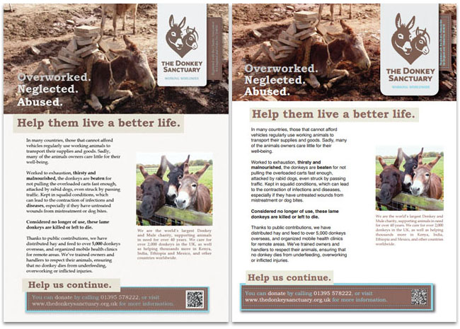
InDesign version on the left, Quark practice on the right. The Donkey Sanctuary’s website has a pleasing colour scheme, which has been carried over to this. I also used a method from The Sun newspaper, in that specific words are made bold for emphasis.
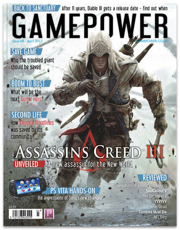
Moving on to this magazine cover, there’s a lovely triple meaning in the cover line “Second Life”: First off, it’s the name of an unrelated but well-known video game. Secondly, Vampire: Bloodlines is based around Vampires – creatures in their ‘second life’. Finally, Bloodlines has been given a new lease on life since the development studio closed, as fans fixed bugs and restored incomplete content!
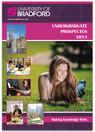
Next is a Prospectus cover for the University of Bradford – A mixture of its appearance back in my day, and the ones they currently distribute. Check out the watermark down the right-hand side, in the dark purple bars.
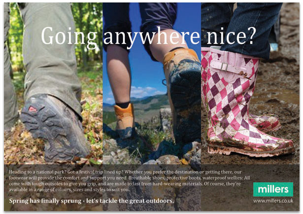
This is actually a preferred yet alternative take, which sprung to mind while composing another advertisement for the same outdoor retailer. In a further amendment, the main paragraph originally began “your hairdresser’s prime question – so what’s your answer?”.
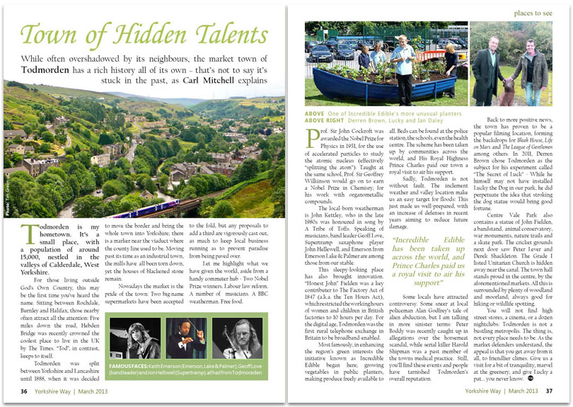
Playing journalist, I wrote the copy on this magazine spread as well as composing the layout. I learned while researching this that Countryfile magazine does not keep a consistent style across its articles – perhaps they are aiming for a “scrapbook” feel. And yes, I have been to see the Lucky Dog statue mentioned in the above.
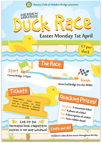
Finally… OK, I admit this looks like an illustration. Let me point out that the bridges on the poster’s map resemble the actual bridges used for the race, and surprisingly, it took a bit of digging to determine which two bridges they use.
I’ll be filtering these into my site and PDF portfolio (itself arranged in InDesign) while getting my Quark knowledge bulked out. We’ve reached the end of this edition, so here’s your answer to the opening reference.