Twitter rolled out new look profiles last month, allowing higher resolution avatars than before. I opened my Photoshop file to export a larger copy, made sure the glasses resemble my current pair… then lopped off the quiff (as I no longer sport one).
The official Twitter logo had its hair cut in 2012.
The human self-portrait, displayed on my portfolio cover and in the top-right of this blog, has also been shorn and contemporised…
Happy Star Wars Day! The Fourth of May be on your side, or words to that effect.
As one of my best-known works, it’s funny it’s not had a write up – Ackbarpography was made pre-blog. The origin is now unclear, but one day in 2009 I was struck with the urge to try Type Art, and merging Star Wars characters Admiral Ackbar with his famous phrase “It’s A Trap!” was the one for me.
I traced an image of an Ackbar Lego Minifig to get simplified, head-on features. I then spent considerable time making the letters into facial features while, keeping them legible and in order. I was hesitant to add “non-letters” in to complete the face, getting away with the eyes because they’re at either side. Along with a collar, I added a hatched head shape behind everything to cohere the lettering together.
In my last post I mentioned that I had many tasks for the New Bradford Playhouse’s in-house production of Maskerade. Last time we talked posters. Today, we focus on the programme.
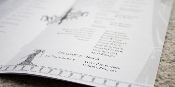
A 12-page booklet, the whole thing was designed to be printed in black and white on ordinary office paper. The audience got such a version, while I gifted some cast and crew members this borderless, colour cover variant. It contains the usual suspects: a synopsis, cast list, crew list, rights, a word from the director, a bit about the theatre and what’s being performed there next. A nicety is that being an internal production on a shoestring budget, there’s no advertisements. The cast pages ended up being the centre spread, which was ideal.
This month The New Bradford Playhouse put on an in-house production of Maskerade, adapted from the Terry Pratchett book of the same name (think Phantom Of The Opera with humour and witches). I haven’t been on that stage in a long time, and love the works of Pratchett, so I signed up.
My main role was one of the stagehands who are actually part of the play, so as well as spouting lines i’d shift furniture, in sight and out of sight of the audience. I had two other bit-parts in one scene each, with quick costume changes. Along with learning script, stage directions and set mechanics, I also made the show’s programme, some posters, two Papier-mâché masks for the cast, and one mask for myself. In 4 weeks. Oh, and I started a new full-time job at the same time.
My brother is a web developer who lives down south. He’s doing so well that he’s starting up a Limited company to be his own boss: Daft Apeth Industries, a name he’s been using for years. Naturally knowing what I do, he called up and said I could help with his branding.
Starting out, I drew both humoured chimps in flat caps and self-closing HTML tags with hammers. Here are the neater ones:
Bit of a Soviet thing going on with the hammers and red.
Brother liked the font on the latter, and the ape on the former. The feedback was “make him less goofy and more angular”, in black and white or one-colour (clearer and saves on print costs)…
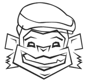
Stripping it back to the outlines, I challenged myself to re-draw the Apeth without using the Convert Anchor Point Tool (I love that little hollow cursor). Only straight lines. The result wasn’t too shabby…
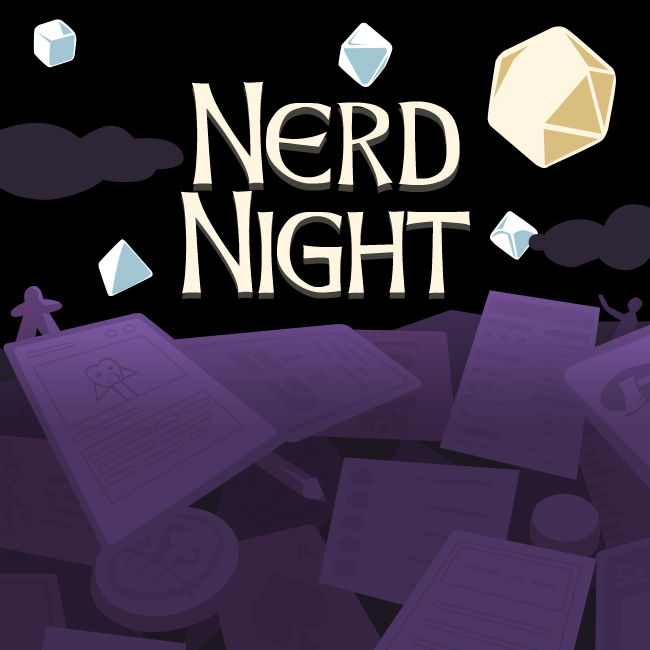
Regular collaborator John (he of Final Boss Fight) is always expanding his media network; the latest from his team is Nerd Night, a tabletop gaming podcast. Like comics are so much more than Superman, tabletop games are way more than Cluedo.
‘Nerd’ always makes me think of Homer shouting it in The Simpsons. Me and many of my friends are nerds, it’s fine. I’ve lived with several people who play tabletop games / card games / pen-and-paper RPGs, and they’ll often get a set out whenever groups come to visit – Last time it was a few rounds of the interesting but unpronouncable Hnefatafl, then watching them conquer Europe’s rail network in Ticket to Ride.
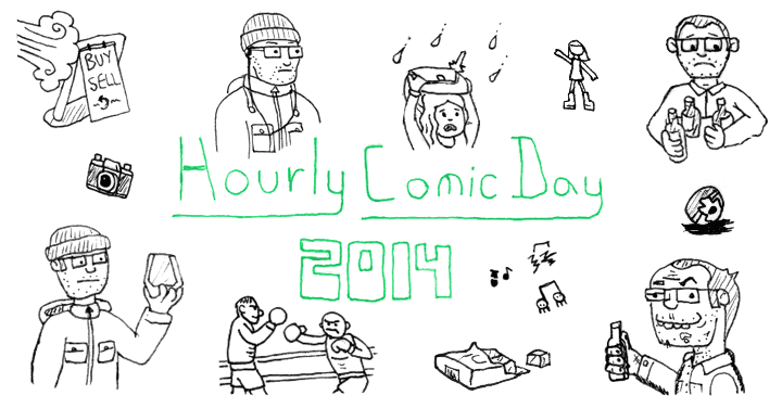
This is my fourth year of Hourly Comic Day: As with previous years, I got sketches and notes done at the time and sat down to draw them the next day (otherwise i’d get funny [funnier] looks in the nightclub with pencil and paper). Stuck with 2 panels an hour.
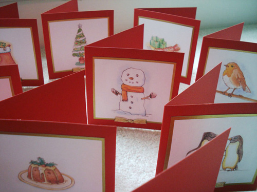
Last year my Christmas cards were store-bought with a doodle drawn inside. This year my own watercolours are on the front!
Each card has a different picture; I’m particularly pleased with how the animals (drawn from reference) came out. The pics are applied to the front of each card with a gold backing, and a bit of gold ribbon in a tiny classic knot.
Many are celebrating the start of the eighth generation of video games consoles today, with the launch of the PlayStation 4 in the US… seemingly ignoring that the Wii U was released last year. On this frabjous day, i’ve decided to share my gaming machines icons pack.
Sony consoles say Hi.
I started the pack years ago to use with emulators and practise my pixel art. Initially drawn up for 256 colours and 32×32 dimensions, they don’t use that old Windows standard colour palette now, yet the CDs are the only icons that go over 32 colours, and the only ones which took anything more than the Pencil tool to create.
I have a few older revisions kicking around, so can show you some improvements that came with time:
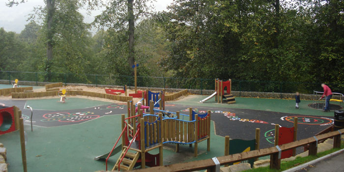
Cliffe Castle Museum contacted me a while ago (I can’t tell you when, as the email has disapparated) – They were getting the builders in to construct a new children’s playground, and asked my permission to put Cliffe the Caterpillar on it!
I gave the go-ahead, and they proceeded to lay down some outlines with thermoplastic. By the time August rolled around, news broke that the playground was ready to open to the public. I eventually found some time to stop by in a very wet and grey October…