My brother is a web developer who lives down south. He’s doing so well that he’s starting up a Limited company to be his own boss: Daft Apeth Industries, a name he’s been using for years. Naturally knowing what I do, he called up and said I could help with his branding.
Starting out, I drew both humoured chimps in flat caps and self-closing HTML tags with hammers. Here are the neater ones:
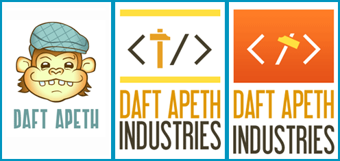
Brother liked the font on the latter, and the ape on the former. The feedback was “make him less goofy and more angular”, in black and white or one-colour (clearer and saves on print costs)…
Stripping it back to the outlines, I challenged myself to re-draw the Apeth without using the Convert Anchor Point Tool (I love that little hollow cursor). Only straight lines. The result wasn’t too shabby…

I put some curves back in (but not as many as before) then made a few hat and shading patterns.

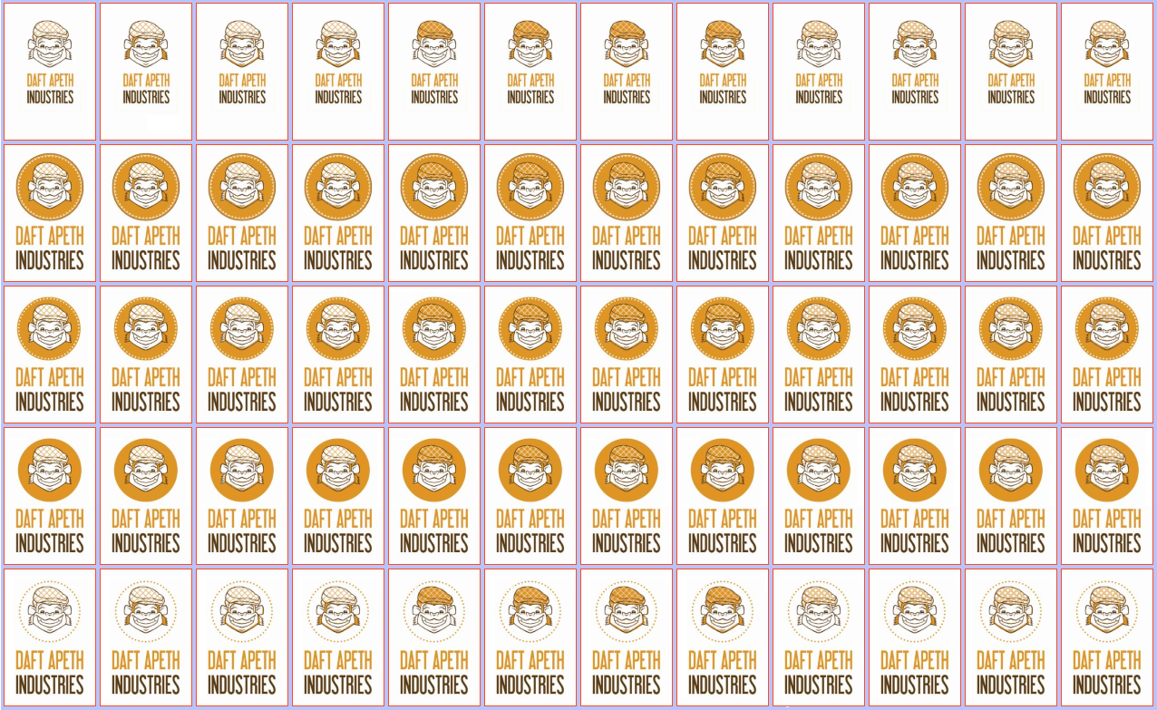
Combinations of these patterns led to many variations in colour scheme. Then deciding how to frame it added still more. This is where I went a bit cross-eyed.
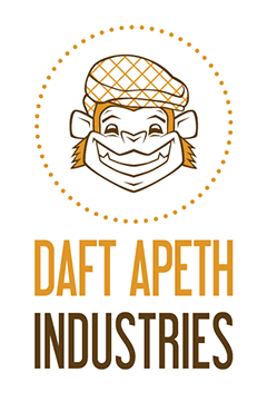
Despite both being born and raised in Yorkshire, we’d both taken the phrase quite literally, seeing “ape” and thinking “monkey”. It turns out that “A’peth” is short for “ha’p’orth”. Which is short for “Haypnee’worth”. Which in English is “Half a penny’s worth”. We Yorkshire folk are dead efficient with letters.
Calling it a Northern Monkey instead of an Apeth partially solves that quandary. For the rest, to fit in the original coin meaning I made several round backdrop options. This ended up being a ring of beading that stops the head getting lost in whitespace away from the type, without drowning him out in a big brown circle.
Finito!
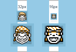
I’ll be making a simpler alternative to be used when the logo needs to be really small, as the lines get too thin and muddle together below 25% magnification. While “larger” icons (such as those for iPhone screens) will be made from this, there’s a couple of tiny pixel art re-workings for favicons that I drew specially.
A long blog post, but there you go. Brother’s site is currently undergoing heavy renovation, but the above image is on the splash page. One happy munkeh.