
My company has giant cheques. You know the ones; when there’s a donation to charity, or someone wins a cash prize, you see a photo in the paper of a happy chappy holding an oversized rectangle.
We had a number of big paper cheques, supplied by our chosen bank, rolled up in a fat parcel tube. It was decided that we needed something better, ideally personalised with our own branding, and more hard-wearing.
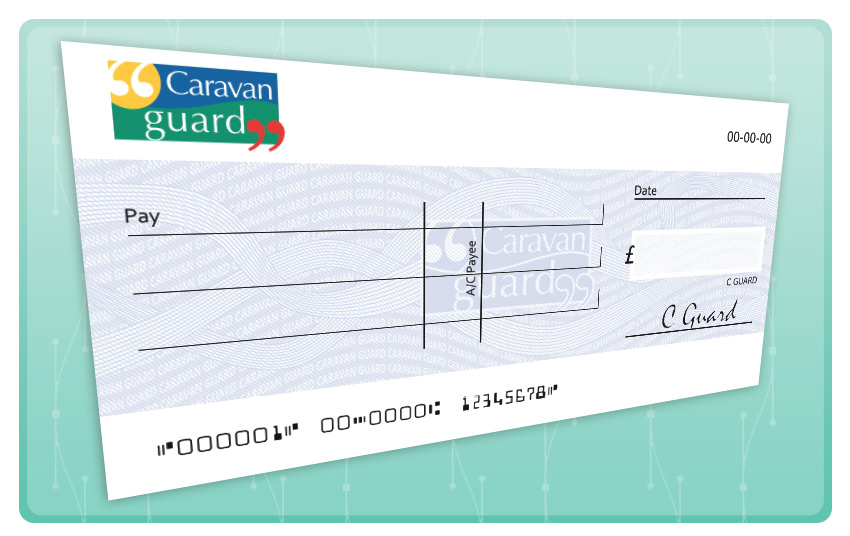
This is what we came up with.
Taking shape
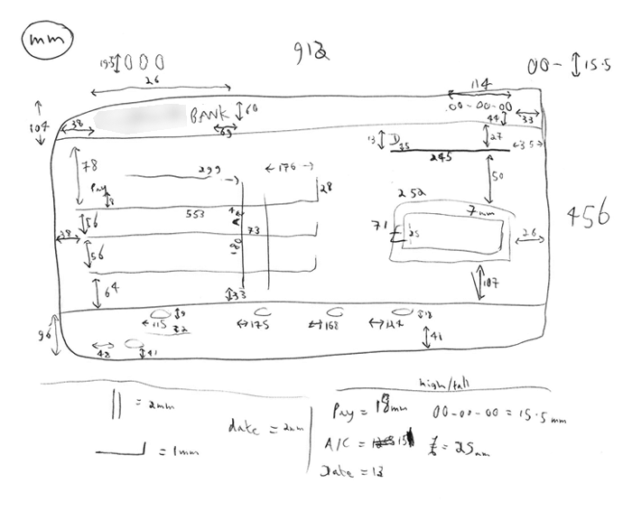
The basic layout of all cheques is the same, so I took a lot of measurements of the big paper ones we had, with both tape measure and ruler…
 This was mixed with a few minor variations found on Google Images, by personal preference, and that was the basic blocking in Illustrator done.
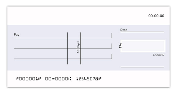
Making your mark
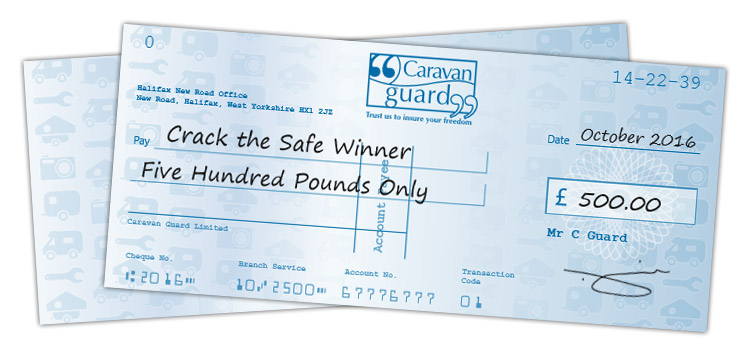
That was the easy part – next came the “watermark” ribbon patterns you get in the background. The circular ones are called Guilloché, and I found this tutorial the most useful. Making the patterns took a little mental gymnastics, and I based them on the “old” cheques, but I got some serviceable wibbles on there.
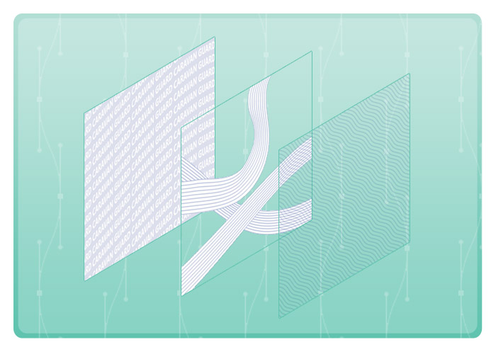
I got three overlapping patterns in. From left to right:
- Pattern #1 (words) is one thick wavey line shape (fill, not stroke) with repeated text over it, combined using a warp – Object > Distort > Make With Top Object.
- Pattern #2 (ribbons) is two “outer” lines, with eight intervening lines added using the Blend tool. This method allows a varying width, which a pattern brush would not.
- Pattern #3 (waves) is a fill pattern – the hardest part was getting a seamless tile diagonally (use the rotate tool on the box you’ve filled and tick the ‘strokes and effects’ box)!
The particular lettering and barcodes along the top and bottom is called MICR (Magnetic Ink Character Recognition). Once you learn the term, it’s easy to find a ready-made font available for download. All that was needed then was our company logo at the top, and an approximation of the Big Boss’ signature (removed from these examples, duh) by the value box.
Toughening up
The big lug is printed on correx board: While you can’t roll it up to stuff in the car boot, it’s much easier to hold up in photo ops, and can’t be torn. I had a word with our ‘roaming’ execs to ensure that it would fit in the back of their cars… they’ll be the ones taking it out on business, after all.
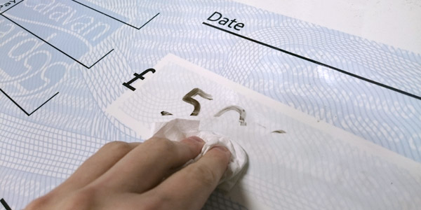
The new cheque’s also got a dry wipe “whiteboard” surface – while the paper cheques got one run-in with a permanent marker before they had to be discarded, one sweep of a damp cloth and this one proves eminently reusable!
By the way, we ended up ordering two boards. It didn’t cost much more than one, and it helps with logistics.
On a smaller note
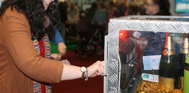
Last month I neatened up our second, much smaller cheque design. We put a couple of these props in a ‘prizes’ cabinet at trade shows… obviously you don’t want to put a real signed cheque in there.
First designed (by me) in late 2014, way before the big cheques, it has a very different look. It also has a very different use, and we’ve seen no need to unify the designs. While there is one “Spirograph” guilloche over the value box, the background is instead a cascading tile pattern of the several products we insure: Touring caravans, motorhomes, etc. The icons used were shown in my ‘christmas switch on‘ post.
The clever and sneaky parts are the MIRC numbers at the top and bottom. Not the branch number, which forms “10 to 500” (the range of prize money available), nor having our full address in case a delivery needs to be made…
Say one of our team members, across the country with this display, gets in a fix and needs to call me back at ‘basecamp’. They can combine the top numbers with the first or last 4 digits from the account number, which will decipher a phone number for Marketing direct dial(s)!
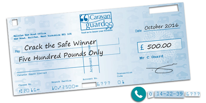
…or they could just call our main switchboard, a number which is easier to remember, and written on our brochures that’d be all over the stand.
Bah, it entertained me while making it.
So there you have it; Little and Large. Thanks for cheque-ing out the post!